Streamlining global financial services with an advanced Power BI dashboard.
- Industry: FinTech
- Country: USA
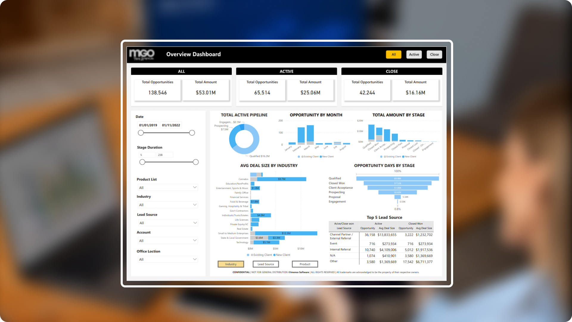
The main objective of this Power BI dashboard is to provide a comprehensive and user-friendly view of financial data. The dashboard helps in tracking key metrics such as client engagement, service performance and financial growth. By offering easy to understand visuals and insights, it supports informed decision-making and enhances the efficiency of financial services for client worldwide.
The core challenges
- Data integration:Since the organisation operates across multiple countries and offers a range of financial services, it is important to correctly integrate and unify the data that arrives from multiple sources. We used Power Query Editor to solve this problem by making sure the data is correctly formatted and merged.
- Data security: It's critical to stop data leaks because financial data is sensitive. To secure data and manage access based on user responsibilities, we deployed Power BI's data protection features, including as Row-Level Security (RLS) and Object-Level Security (OLS).
- User accessibility: The dashboard needs to be user-friendly and accessible to a wide audience because clients and team members are spread across many nations and languages. To accommodate a range of user requirements and language choices, we created an intuitive interface that is both easy to use and navigate.
- Real time data update: Real-time or nearly real-time data updates are necessary for the industry which operates worldwide. We set up regular data refresh schedules to make sure the dashboard displays the most recent information and seamlessly interacts with real-time data streams in order to deliver timely insights.
Solution We focused on developing a comprehensive and user-friendly tool to address the main issues and improve dashboard functionality. Our solution consists of trend analysis across several regions and industries, easy report embedding into web apps, and using a variety of visualisations to make financial data easier to see. Together, these features help users' access to, integration with, and understanding of data.
-
 Trend analysis: To analyse financial data across various industries, goods, and places, we built trend analysis features. This gives customers a thorough understanding of performance trends by enabling them to spot patterns and insights that are customised for particular groups.
 -
 Multiple-Visuals: To show various financial metrics in an understandable and clear way, we made use of a range of visualisations. We made sure that customers could quickly and effortlessly understand complex financial data by combining a variety of visual styles.
 -
 Embedded report: The report was embedded directly into the online application. By allowing users to interact with the dashboard from within their main application, this connection enhances accessibility and streamlines user experience.
Integration.
Equipped with variety of features.
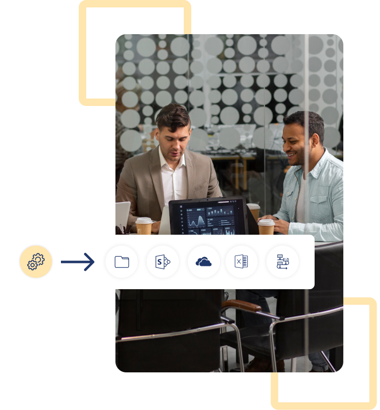
To improve usefulness and connectivity with other tools and apps, Power BI offers a variety of integration possibilities. For this project, we made use of some of the below integrations.
- SharePoint Folders
- SharePoint
- One Drive
- Excel Spreadsheets
- DataFlow
Enhancement.
By adding practical features.
We have enhanced the dashboard with features that make data exploration and visualization more interactive and engaging, leading to a more insightful experience.
Company colour theme and customised UI
To ensure a unified and branded look, we used the company colour theme across the dashboard. We also made adjustments to the user interface to improve its aesthetic appeal and usability, which resulted in a dashboard that is both aesthetically pleasing and functionally consistent with the company's branding.
Navigation buttons
To enable smooth shifting between the dashboard's tabs, navigation buttons were included. This feature makes sure that users may navigate between various parts and insights with ease and without losing their context.
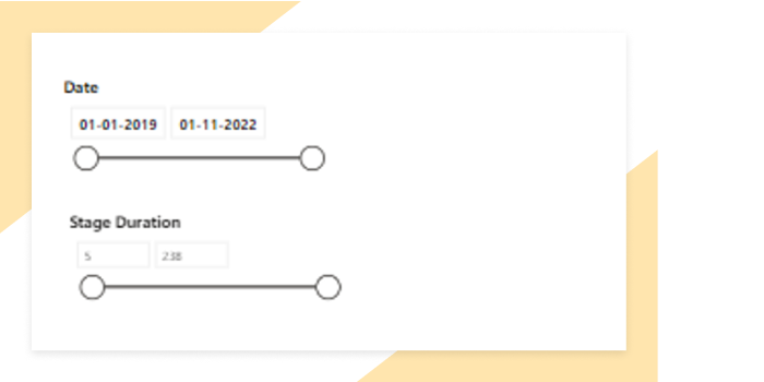
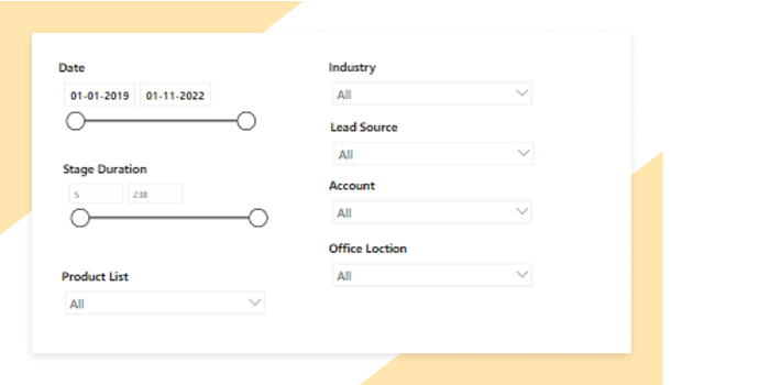
Slider for slicer
To enable users to modify the range of data being shown, a slider was incorporated into the slicers. This feature improves the accuracy of insights and makes it easier to focus on particular data ranges.
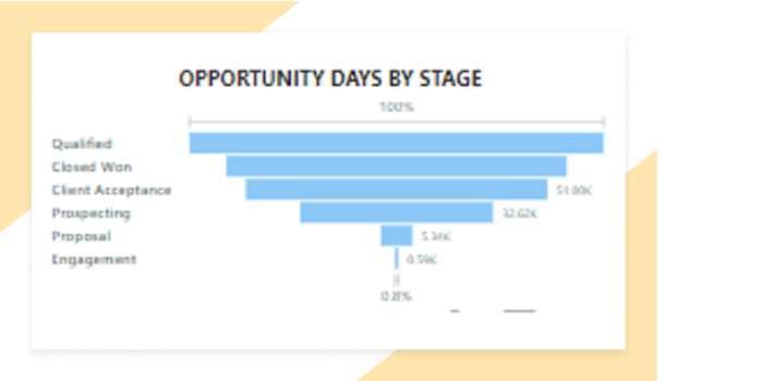
Funnel chart
To illustrate the stages of data flow and progression graphically, we incorporated a funnel chart. Users may better understand the effectiveness of different processes and conversion rates in the financial data by referring to this chart.
Slicers
To allow users to filter data and get more focused insights, we included a variety of slicers. Better analysis and customised data exploration are made possible by these slicers.
Explore more.
Additional features.
Key performance indicators. Employed a wide range of KPIs to carefully evaluate and enhance the productivity and overall performance of the chemical manufacturing sector.
Export preferred charts/KPIs. With the export function, users can quickly save it in the format that best fits their requirements. A variety of formats, such as Excel, CSV, and PDF, are available for selection.