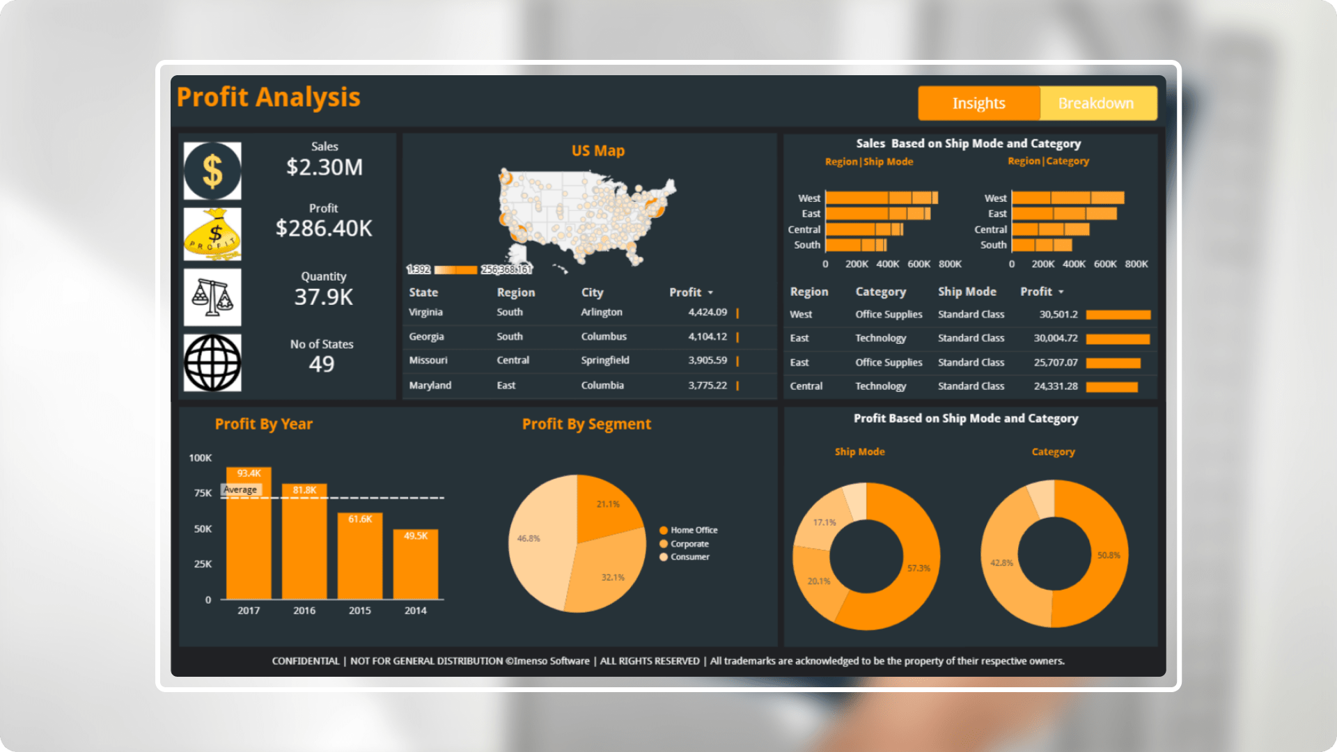
Data driven insights on profit and sales distribution.
- Industry: eCommerce
- Country: USA
The main aim of the Profit Analysis Dashboard is to provide a detailed assessment of financial performance, empowering business stakeholders to make informed decisions that drive profitability and growth. This dashboard enables organizations to gain insights into profit margins, cost structures, and revenue streams.
The core challenges
- User experience & engagement: Enhanced the usability and driving user adoption of a Profit Analysis dashboard necessitates an emphasis on intuitive design, personalized features, user training, and ongoing support. By creating a dashboard that is user-friendly, adaptable, and aligned with user workflows, we can boost satisfaction and engagement, ultimately leading to increased adoption rates.
- Data quality and integrity: Inaccurate or inconsistent data can distort profit assessments and lead to misguided strategic decisions. Implemented robust data validation processes and regular audits ensures high-quality data, which is crucial for reliable analysis and informed decision-making.
- Integration with existing systems: Seamless integration with existing financial and operational systems is vital for maximizing the effectiveness of a Profit Analysis dashboard.
Solution We have developed an advanced Profit Analysis dashboard tailored for the Retail sector, designed to transform intricate financial data into clear and actionable insights. This solution features a robust set of visualizations focused on profitability metrics, empowering professionals to easily analyse and interpret critical financial information.
-
 Improved user interface: The UI of the Profit Analysis dashboard is designed with clarity and usability in mind. It offers a visually appealing, intuitive layout that enhances user experience, making it easy to navigate and interpret vital profitability data.
 -
 Interactive visualizations: The dashboard includes dynamic charts and graphs that allow users to explore profit margins, cost breakdowns, and revenue streams interactively. This feature supports deeper analysis and helps users uncover trends and insights quickly.
 -
 Comprehensive KPI tracking: The dashboard monitors essential profitability KPIs, such as gross profit, net profit margin, and cost of goods sold. This ensures that stakeholders have real-time visibility into financial performance across various dimensions, including time, product, and region.
 -
 Clear design: The dashboard simplifies complex financial data, presenting it in a straightforward manner that is easy to understand briefly.
 -
 Embedded reports: Embedded reports in an analysis dashboard enhance user experience by providing detailed, interactive, and customizable insights without requiring users to leave the dashboard.
Integration.
Equipped with a variety of
data sources.
Organizations may increase decision-making, data accessibility, workflow efficiency, and process streamlining by integrating. We used the following integration capabilities to generate this report:
- Google Sheets
Customization.
How we played with charts?
In order to effectively display the data, we did more than just add charts; instead, we gave each one a unique design that served its intended function.
KPIs
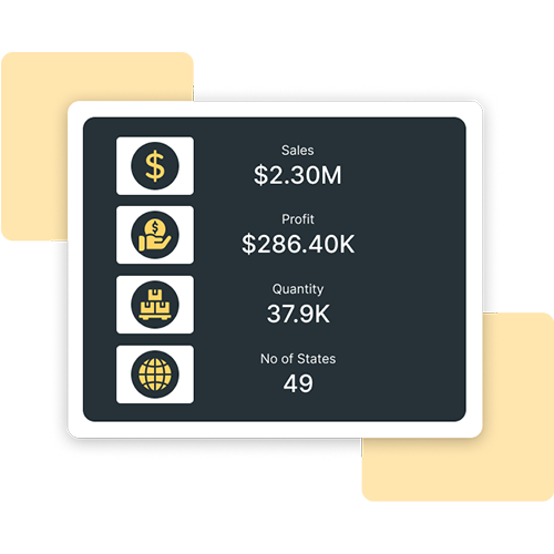
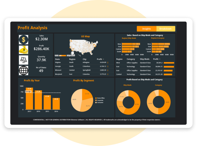
Created KPIs where we included sales, profit, quantity and number of states.
Page navigation
User can easily switch from source to destination through Page navigation.
Enhancement.
By adding useful features.
Dynamic visualization techniques
Adding different kinds of charts, like bar and pie chart and cards, makes the dashboard look better and makes the user experience more interesting and immersive.
Combo & pie chart
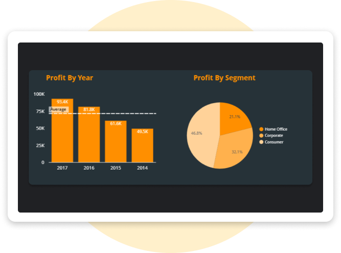
The Bar Chart represents the Profit values over four years and the pie chart show the profit distribution across three business segments.
Do-Nut charts
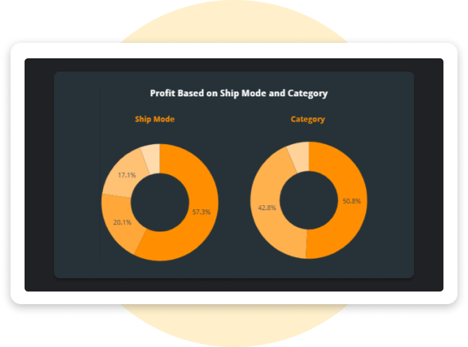
This Do nut chart shows the Profit distribution across different shipping modes and product categories.
Bubble map
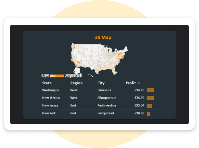
The bubble map represents the Profit across State, Region and City.
Explore more.
Additional features.
Real-Time data updates. The dashboard provides real-time data refresh capabilities, ensuring users have access to the most current financial information for timely decision-making.
Responsive design. This dashboard is accessible and functional across all devices, including smartphones and tablets, allowing for on-the-go insights.
Export preferred charts/KPIs. With the export feature, users can easily clean up their data and save it. There are several methods to export a BI report. Here's a list of common export methods: PDF, Power Point, Excel, CSV, Web, Service API
