Advanced analytics for broadband providers
- Industry: Media and Entertainment
- Country: USA
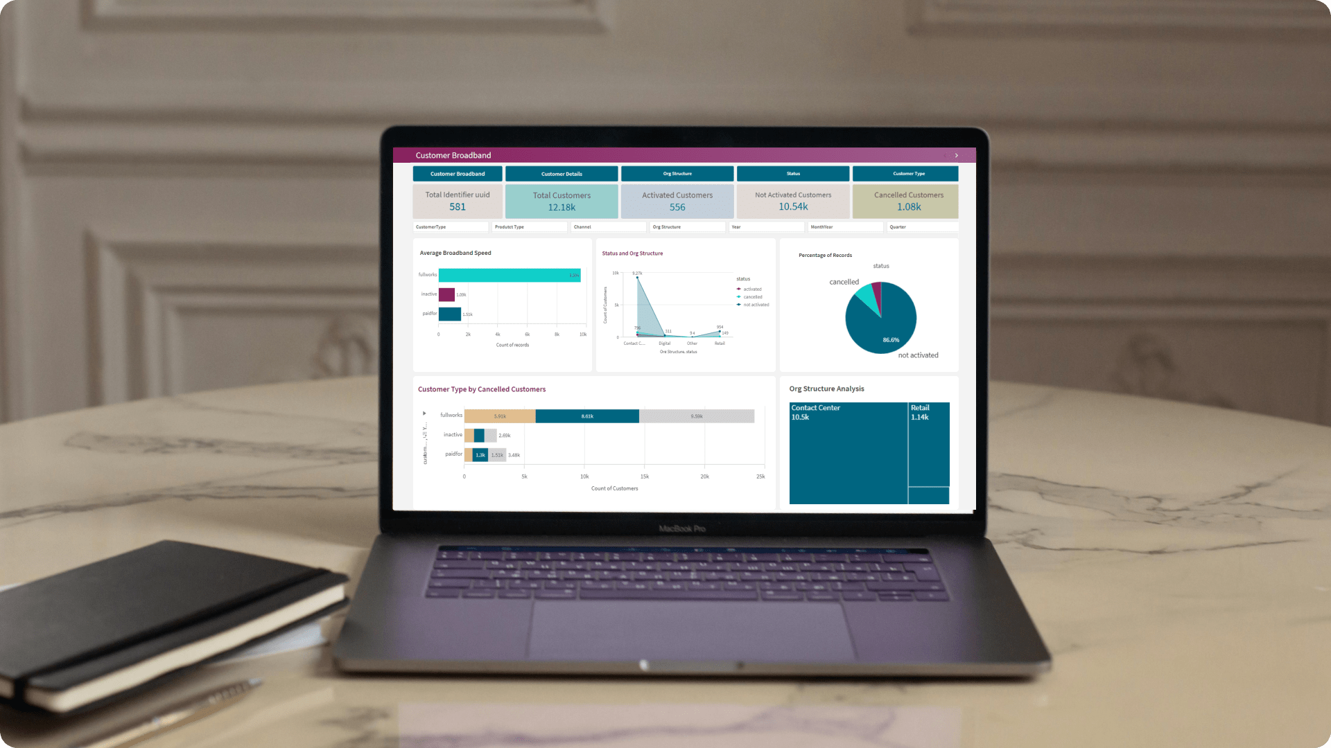
The goal of this dashboard is to analyze broadband customer behavior and identify factors that lead to customer loss. By looking at metrics like customer lifetime value, service usage patterns, and satisfaction scores, we aim to understand customer needs, anticipate cancellations, optimize services, and improve customer experience.
The core challenges
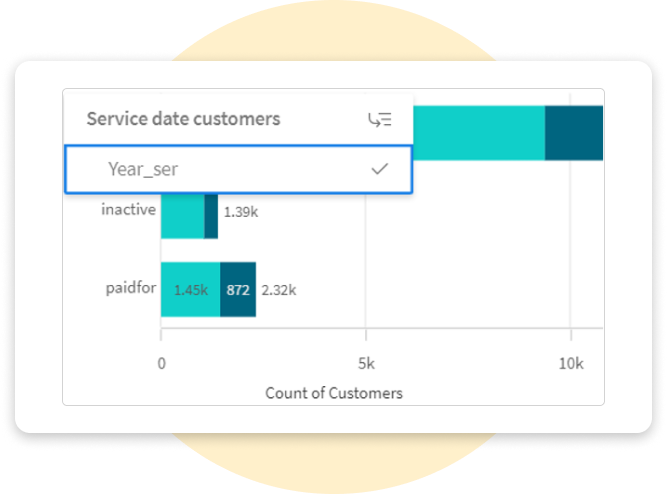
- Customer segmentation: Accurately segmenting customers based on their status (active, non-active, canceled) and other factors such as service start date, product license, and channel. We used dynamic filtering and grouping in Qlik Sense to segment and analyze customer data effectively.
- Data accuracy: Ensuring the data used for analysis is accurate and up-to-date, particularly concerning service start dates, activation, and cancellation dates. Implemented automated data validation and continuous updates to keep all information accurate and current.
- Time-Based analysis: Analyzing trends over time, such as changes in customer status by year or month, to identify peak periods for activations and cancellations. Utilized Qlik Sense to track and visualize changes in customer status, highlighting trends and peak periods.
- Customer attrition analysis: Identifying patterns and causes of customer attrition by analyzing cancellation dates and related attributes. We examined cancellation data and applied predictive analysis to uncover patterns and develop strategies to reduce attrition.
Solution We have created an advanced data visualization tool designed to simplify the presentation of complex data, making it easy to understand.
-
 Data modeling: Create a data model that integrates all relevant fields (e.g. report date, activated date, canceled date, service start date, customer type) to support comprehensive analysis.
 -
 Customer status categorization: Develop calculated fields or use set analysis in Qlik Sense to categorize customers as active, non-active, or canceled based on their service start, activation, and cancellation dates.
 -
 Time series analysis: Use Qlik Sense’s time series functions to analyze trends in customer status over time, identifying any seasonal trends or spikes in cancellations.
 -
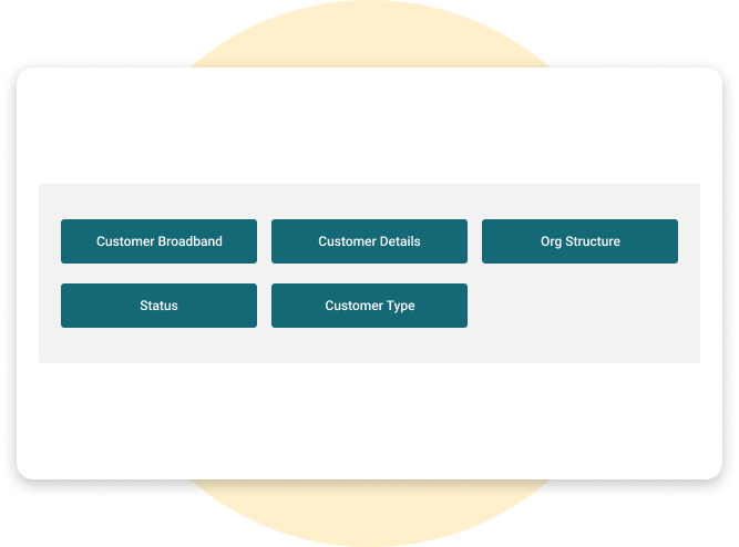
 Dashboard creation: Design interactive dashboards with filters for different dimensions (e.g. channel, customer type, license product) to allow users to drill down into specific segments of Interest.
Integration.
Equipped with a variety of
data sources.
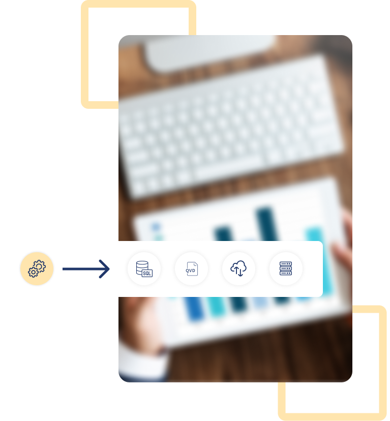
Qlik Sense’s power and flexibility are significantly enhanced through its integration with numerous applications and tools. This report explores several of these integrations and their impacts.
- Flat files
- QVD files
- SQL
- Oracle
Customization.
We've customized each chart to enhance data visualization. By aligning them with there specific characteristics, we ensure accurate data representation, which improves insights and usability.
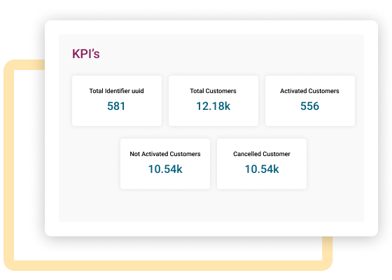
Customized KPI dashboards
Create KPI indicators to display key metrics such as total active customers, average time from activation to cancellation, and new customer acquisitions.
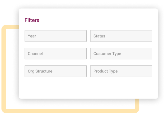
Dynamic segmentation
Implement dynamic filters and segmentations based on user inputs, allowing for real-time analysis of different customer groups.

Pivot table filters
Use slicers to provide an interactive way to filter data within the pivot table and report filters to control the overall data view without changing the structure of the pivot table.
Enhancement.
By adding useful features.
Interactivity
Add interactive elements like tooltips, drill-downs, and hover effects to provide additional details.
Navigation buttons
Add buttons like Next Slide to facilitate smooth and intuitive navigation throughout the presentation.
Explore more.
Additional features.
Dynamic data exploration. Build interactive dashboards in Qlik Sense with intuitive filtering options, enabling users to engage with visualizations and dynamically update data views based on their filter selections.
Interactive visualizations. Enable users to click on specific data points to explore and reveal more detailed information.
Export preferred charts/KPIs. Users are provided with an intuitive interface that allows them to easily select and export the charts and KPIs of their choice from the Customer Qlik Sense app.