A comprehensive Power BI dashboard for shipping industry insights.
- Industry: Logistics
- Country: Hong Kong
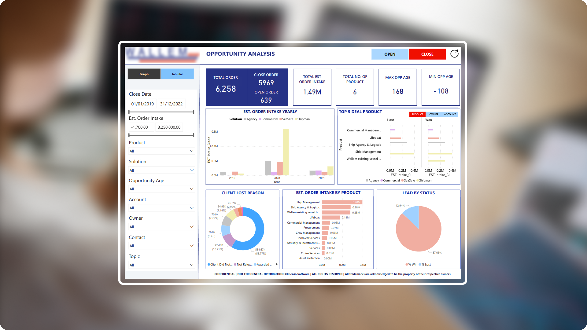
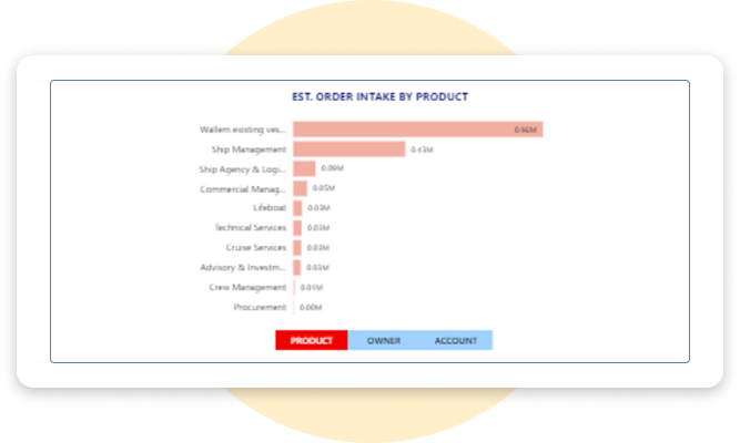
The primary objective of creating this Power BI dashboard is to streamline the monitoring for shipping industry. By visualizing key metrics such as open and close order, yearly order intake, client retention reasons, product specific order trends, the dashboard offers valuable insights for optimizing order management and client relationships and support informed decision-making and strategic planning.
The core challenges
- Diverse data sources: The industry operated across multiple marine sectors, generating data from ship management, crew statistics, safety compliance and operational metrics. Integrating and standardizing this diverse data for analysis required extensive use of Power Query Editor to transform and cleanse raw data from multiple sources before loading it into Power Bi datasets.
- Dynamic operational metric:The marine industry involves various dynamic metrics, such as ship performance and crew availability, which changes frequently. Developing measures and visualizations that adapts to these shifting metrics required creating flexible DAX formulas and interactive dashboard elements to provide real-time insights.
- Data privacy and security: Ensuring the security of sensitive marine data was critical. We implemented Row-Level Security (RLS) to maintain confidentiality and integrity.
Solution To address these challenges, we have developed a customized Power Bi dashboard to help marine industry to manage and analyse their data. This dashboard features customize visualizations, and interactive elements providing clear insights and streamlined data exploration for marine professionals.
-
 Enhanced user interface: The dashboard is designed to be easy to use and understand. With a clear and simple layout, users can quickly find and interpret the data they need.
 -
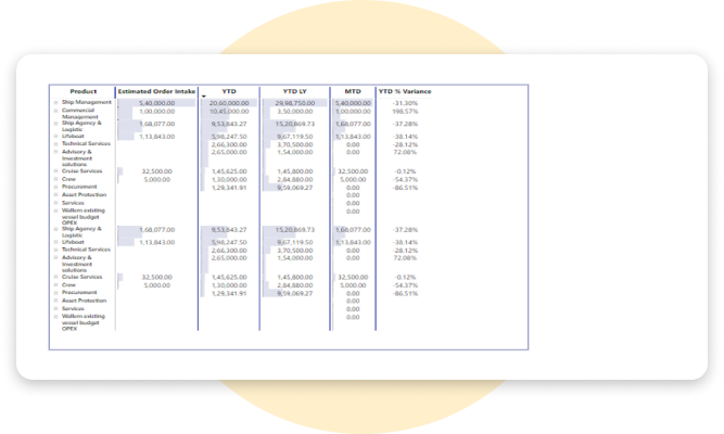
 Data modelling: We build a strong data model that connects different tables of information. This ensure that all data is accurate and consistent, making it easier to analyse and make informed decisions.
 -
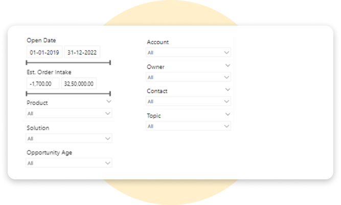
 Multiple slicers: We added multiple slicers to the dashboard, allowing users to filter and drill down into specific information. This makes it easy to explore detailed insights based on selected criteria.
 -
 Reset filter button: We included a reset filter button, allowing users to quickly clear all applied filters. This makes it easy to explore different data views and insights by resetting and selecting new filters with a single click.
 -
 Data conversion: Using Power Query editor, we automated data extraction and transformation process.
 -
 Calculated measures: We developed custom calculations to provide insights that are most relevant to users. These calculated measures helps in deriving meaningful and actionable data points.
Integration. Equipped with a variety of data source.
We expanded the capabilities of our Power BI dashboard by integrating with various data sources to enhance functionality and compatibility of out report, allowing us to seamlessly interact with other tools and applications.
- SQL
- Excel
- SharePoint

Enhancement. By adding useful features.
We have enhanced the dashboard with features that make data exploration and visualization more interactive and engaging, providing a more insightful experience.
Condition Formatting
Dynamic modifications such as changing the background colors of rows based on specific conditions.
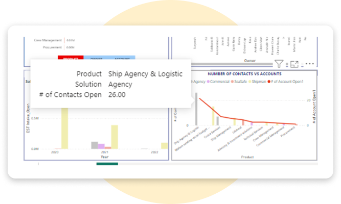
Tooltips
Tooltips provide extra details and keep the right filters in place, helping users to get deeper insights.
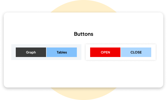
Buttons
Users can easily switch between different location reports by clicking buttons, making it simple to view specific data.
Synchronizing slicers
Slicers are synced across all pages, so filters stay the same as users move through different tabs, keeping everything consistent.
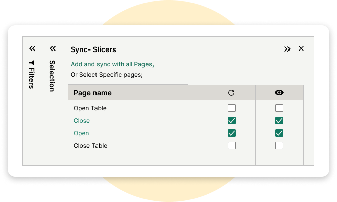
Slicers
Different slicers let user pick specific categories, instantly showing the related data in the KPIs for easy exploration.
Bookmarking
The bookmarking feature allows users to switch between different visuals for various information while staying on the same dashboard tab, making it easy to compare data without navigating away.
Refresh button
Users can easily clear all the filters by clicking the refresh icon, allowing them to rest the dashboard and start a new analysis.

Explore more. Additional features.
Implementing scheduled data refreshes. This report's implementation of schedule data refresh ensures that the shipping information is regularly updated, maintaining its relevance and accuracy over time.
Improving the user experience with customized UI. To enhance accessibility and functionality for the shipping industry, it was necessary to refine the visual layout, incorporating intuitive navigation components and optimizing interactive features for smoother user engagement.
Key Performance Indicators. Incorporated a diverse array of Key Performance Indicators (KPIs) tailored to systematically assess and boost the efficiency, effectiveness, and overall performance of shipping operations.
Export preferred charts/KPIs. With the export feature, users can easily clean up their data and save it.There are several methods to export a BI report. Here's a list of common export methods. PDF, PowerPoint, Excel, CSV, Web, Service API