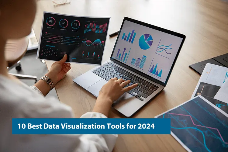
Top 10 Data Visualization Tools for 2024
Are you feeling overwhelmed and unable to make sense of the sea of data available?
You are not alone. Every day, we generate a large amount of data, about 402.74 million terabytes. And it’s only going to increase! This can be challenging for entrepreneurs, businesses, and individuals, making it difficult to find relevant information. According to research, businesses that use data visualization tools are 48% more likely to find information quickly. These tools turn intricate data into clear, visual stories, making them easier to grasp and use.
In this article, we will everything about data visualization and introduce the top 10 tools for 2024. These tools will help you turn raw data into clear and interesting visuals. These tools can help you make smart decisions and achieve success. Let’s get started!
Why Is Data Visualisation Important for Businesses?

Data visualization is like having a magic wand in business. It takes all those complicated numbers and converts them into easily understood graphs and pictures. With Data Visualization Consulting the data isn’t just something you’re viewing; it manifests before your very eyes. Furthermore, better decisions and smoother communication result from having the data visible and understandable to all.
Consider this: by using data visualizations, you can do more than just crunch numbers, you can find hidden gems, detect trends, and monitor the status of your project. It provides you with an edge over others akin to possessing a covert weapon.
1. Better Understanding and Interpretation
By converting these raw numbers and figures into visual representations like graphs, charts, and maps, data visualization helps people grap and digest lengthy data more easily. Startups can spot trends, patterns, correlations, and anomalies more quickly when data is presented visually than when it is presented raw.
2. Enables Smart Decision-Making
You can not afford to rely on your guts in this competitive market dynamic. Every decision you make must be data-driven. Data visualization tools can help by transforming complicated information into simple visuals. These tools provide data access to everyone in a company, from marketing managers to top executives.
Whether a marketing manager is monitoring campaign success or a top executive is analyzing business metrics, these user-friendly tools help everyone make decisions quickly, confidently, and with knowledge. Working with a Data Visualization Consultant ensures that decision-makers have access to the appropriate information, allowing them to address any problem with precision and clarity
3. Clear Communication of Insights
Effective interaction is vital for making sure everyone in an organization is on the same page and taking action together. Visuals, like charts and graphs, are great for this. They help teams share complicated ideas and discoveries in a way that’s easy to grasp, interesting, and easy to remember.
When you show information in pictures, like in presentations or reports, it helps people understand and agree with what you’re saying more. Visual representations of data make presentations, reports, and dashboards more engaging, which helps everyone involved grasp and support the message better.
4. Spotting Opportunities and Risks
Picture data visualization as special glasses for your business. They enable you to grasp data more clearly and discover hidden gems and possible flaws in the information.
When you start visualizing things like how well your company is doing, market trends, and what your customers are up to, it’s like a light bulb goes off. To fully capitalize on these insights, consider hire data visualization developers. They can help you spot great opportunities for growth, come up with new ideas, and make your startup run smoothly
But there’s more! When you visualize your data, you also spot risks that could trip you up, like sales dropping, customers leaving, or parts of your business needing help. With this insight, you can tackle problems before they become big headaches.
5. Better Operational Efficiency and Performance
Think of data visualization as a secret map showing you how to make your company work better. Visualizing your startup’s workflow allows you to identify where everything is operating nicely and where issues are occurring. It helps you to determine which qualities of the process perform well and which require betterment. By sketching out each stage, you can identify delays and work to improve the overall workflow’s efficiency.
It is possible to boost the efficiency and smooth operation of your business by finding inefficiencies, bottlenecks, and problem areas. Additionally, you can learn more efficient time, money, and relationship management techniques. It’s comparable to having superpowers for managing your company.
6. Enables Predictive Analytics
Visualizing historical data is about both the past and the future. When startups recognize patterns and trends in their old data, it’s as if they have a magic wand that predicts what will happen next.
Businesses can guess what will happen in the future by making models based on their insights. To ensure these models are accurate and actionable, working with the best consultants for data visualization can be invaluable. This helps them stay ahead of the competition by predicting market changes, customer behavior, and fluctuations in demand, allowing them to make smart choices and stay on top.
7. Promotes Data Literacy and Empowerment
Visualizing data encourages data literacy within organizations by democratizing access to data and insights.
By providing users with intelligent visualization tools, businesses empower employees across departments to explore, analyze, and interpret data independently. This promotes a data-driven culture with innovations, creativity, and partnership across the organization.
Data visualization is the combination of creating pretty charts and graphs and transforming data into actionable observations that drive startups’ success. Businesses can obtain a competitive edge, encourage creativity, and open new opportunities for growth and profitability in an increasingly data-driven world by using the power of data visualization.
Various Factors For How to Find the Best Data Visualization Tool

Businesses can make significant decisions by picking the right tool for data visualization. It can directly affect the data analysis effectiveness, decision-making processes, and overall startup performance. Here’s a detailed guide on how to find the right data visualization tool:
1. Define Your Requirements
First, you need to set your specific requirements and objectives. Consider factors such as:-
- The types of data you should visualize
- The complexity of your analysis
- The level of interactivity required
- The intended audience for your visualizations
Understanding your needs will help you narrow your options and choose a perfect tool that aligns with your goals.
2. Evaluate Easy Usage
If you have users with varying levels of technical expertise then choosing the right data visualization tool that is smart and user-friendly can be fruitful. Also, look for tools that offer:-
- Drag-and-drop functionality
- Pre-built templates
- Easy-to-grasp interfaces
A simple-to-use tool will ease the visualization process and help users focus on analyzing insights rather than struggling with the software.
3. Consider Scalability
Consider the scalability of the data visualization tool while you anticipate a volume increase or complexity of your data over time. Select a tool that can handle large datasets efficiently and scale with your organization’s growth.
Scalability ensures that your visualization solution remains effective and reliable as your business evolves.
4. Assess Interactivity Features
One of the best features for engaging users and allowing deeper data exploration is the key called interactivity. Look for data visualization tools that offer interactive features such as:-
- Filtering
- Drill-down Capabilities
- Tooltips
- Dynamic Data Updates
Interactive visualizations strengthen users to interact with the data in real-time, finding insights and obtaining more understanding of the underlying patterns and trends.
5. Evaluate Integration Capabilities
While selecting software for data visualization that continuously integrates with your existing data sources, analytics platforms, and workflow systems, you should value integration capability. Opting for data visualization services can ensure that the software seamlessly fits into your current setup, enhancing overall efficiency and effectiveness in data analysis
You can easily access and visualize data from multiple sources without the need for manual data preparation or duplication with integration capabilities.
Go for tools that offer connectors, APIs, or native integrations with popular data sources and platforms.
6. Assess Customization Options
Every business has unique visualization needs and branding requirements.
Pick a tool that offers various customization options for visual elements, layouts, colors, and styles.
Customization capabilities help you to tailor visualizations to your specific requirements, aligning with your brand identity and analytical objectives.
7. Consider Collaboration and Sharing Features
Collaboration is primary for leading data-driven decision-making and creating a culture of transparency and teamwork within your business/startup.
You can wisely choose a data visualization tool with the help of collaboration features such as:-
- Shared Dashboards
- Commenting
- Real-time Collaboration
Additionally, consider how easy it is to share visualizations with stakeholders both within and outside your business/startup.
8. Evaluate Support and Training Resources
Lastly, the data visualization tool vendor offers the level of support and training resources that you should consider.
Look for vendors that provide complete documentation, tutorials, and training materials to help users learn products /services quickly.
In addition, you should consider a supply of customer support ways such as email, phone, or live chat support for timely assistance. This way you get help in case of any concerns or questions.
By considering these factors, you can wisely select a data visualization tool that meets your specific needs, empowers users to analyze data effectively, and drives informed decision-making within your startup/business.
Top 10 Business Intelligence/Data Visualization Tools For 2024 You Can Use

Selecting a proper data visualization tool and developing a basic knowledge about it was fun. Is’nt it?
So moving further we are not going to learn about the amazing ten data visualization tools of 2024. In this section, we have considered these tools by prioritizing their features, popularity, abilities, and significance which is continuously modifying the field of data analytics and visualization.
On the other side if you’ve got a small startup, a huge enterprise, or an individual trying to use the power of data you can fulfill your demands and goals by using these tools as a solution.
Now, let’s check out the pool of the top ten data visualization tools available in 2024.
1. Tableau
One of the amazing choice of tools used for data visualization is called Tableau. It’s a popular tool that allows a user-friendly interface, robust features, and a large library of resources.
Tableau gives a complete package of tools for making interactive dashboards, reports, and visualizations.
To connect to different data sources, perform complex analyses, and share insights, making it a popular choice among businesses of all sizes users can use Tableau.
2. Microsoft Power BI
For those who are already familiar with the Microsoft ecosystem, Microsoft Power BI is an excellent solution.
It’s a great business intelligence tool that allows users to make interactive reports and dashboards fastly. It has amazing drag-and-drop interface features and advanced analytics capabilities.
Also, it’s an outstanding tool for startups or businesses searching for actionable insights from their data because of its robust data modeling features with AI-powered insights. The Power BI Dashboard makes it a primary choice for users looking to effectively visualize and analyze their data.
3. Google Data Studio
Google Data Studio is a free, web-based data visualization tool that provides consistent collaboration with other Google products. It helps users make amazing and interesting dashboards using data from Google Analytics, Google Sheets, BigQuery, and more.
Google Data Studio is a wonderful choice for businesses looking for a cost-effective solution for data visualization with its intelligent interface and real-time collaboration features
4. QlikView
QlikView a strong BI solution has its own successor QlikSense. It is a tool that is known for in-memory processing capabilities and associative data models.
QlikView is more impressive for its users as it allows them to explore powerful data and discover insights and relationships in ways that traditional BI tools often can’t match. For a more advanced and tailored experience, working with a Qlik Sense Developer can further enhance the data exploration process. These experts help unlock the full potential of QlikView’s capabilities, enabling users to gain deeper insights and make more informed decisions.
It’s a deliberate tool that every business is looking for their advanced analytics and ability of visualization. They look for some features such as:-
- Interactive Dashboard
- Ad-hoc Analysis Capability
- Robust Security
5. Domo
All in one amazing platform that considers business intelligence, data visualization, and collaboration tools.
It allows users to combine cards, text, and images in the dashboard of Domo.
Domo contains data visualization tools that give a secure platform where users can perform data analysis after that they can make interesting data visualizations for a better understanding of data solutions.
It is a uniform platform that can easily access the dashboard of users.
6. Plotly
A Python-based business intelligence library that provides various interactive plotting choices is called Plotly.
With the help of Python or a web-based interface users can create customized visualizations such as:-
- Charts
- Graphs
- Maps
The most popular tool among data scientists and developers Plotly can make impressive and eye-catching visualizations with focusing on interactivity and customization ability.
7. Sisense
A data visualization system that provides facilities to allow data analysts to simplify complex data and gain insights for their businesses and others is immensely known as Sisense.
It’s a highly BI-based tool that helps users make exceptionally interactive dashboards, amazing visualizations, and good reports in one platform.
Sisense is a well-performing tool for businesses that are looking for useful data from large datasets should have some features like:-
- AI-Driven Data
- Advanced Analytics
- Scalable Architecture
8. Looker
A secure data visualization tool that is used by users to gain useful data to focus on data modification and exploration is simply called Looker.
In Looker, users can create some astonishing customized features by using LookML (proprietary modeling language) such as:- Metrics, dimensions, and visualizations.
With the help of any particular tool, users can share Looker data visualizations and export these files in any format.
Enterprises can boost their business with Looker’s data-driven decisions. It has some feature that helps businesses such as:-
- Centralized Data Platform
- Collaborative Features
- Analytics Capabilities
9. D3.js
A JavaScript library for creating custom data visualizations on the web is particularly known as D3.js. It has a feature that supports reusable codes and high-volume datasets.
Among designers and developers for its large documentation, community support, and various examples and tutorials D3.js is a famous choice.
10. Highcharts
A JavaScript charting library that offers amazing features like creating charts and dashboards to simplify the work of developers is called Highcharts.
With less coding effort users can make visually amazing and responsive charts and graphs for their web and mobile apps.
Every business prefers Highcharts for interesting data visualizations of their websites and apps with its large API, lots of features, and cross-browser compatibility.
The above-mentioned ten data visualization tools represent the best choices available in 2024, offering various features, capabilities, and flexibility to fulfill the different demands of businesses for all sectors.
One of these tools can suit your requirements if you’re searching for services like self-help analytics, progressive data design capabilities, or adjustable visualizations.
Conclusion
Hence, these were the top 10 data visualization tools that will help you to work productively without any hamper.
For businesses, data visualization is not just software it is a significant aspect of data-driven development.
It is very important to convert raw data into useful knowledge and data visualization helps the most in it. It helps businesses to look into chances, neglect potential problems, and make sound decisions. Businesses that use the best data visualization tools use the data and stay one step ahead of their challengers.
In this blog, we have covered the top 10 data visualization tools of 2024 with the knowledge of how we can select the best tool that helps businesses fulfill their demands with various features and capabilities.
These tools can help you see data in new and interesting ways, whether you’re a corporate leader trying to discover the value of data or an occasional data analyst.
To supercharge your data visualization efforts, consider integrating Imenso Software into your toolkit.
Imenso Software allows a comprehensive suite of data visualization solutions designed to meet the diverse needs of businesses across industries. Get started with Imenso Software to unlock the full potential of your data, gain deeper insights, and drive informed decision-making.
Want more information about our services?

Similar Posts

Expert Solutions for Power BI Consulting Firm: Advanced Data Analytics
Businesses depend closely on their ability to accumulate, system, and interpret statistics in contemporary global data-based systems. Data analytics offers crucial insights into client behavior, operational efficiency, and market traits. One of the main systems for remodeling raw information into actionable insights is Power BI. Whether you’re a small startup or a huge company, utilizing […]...

9 Power-packed Tableau Techniques from Experts
Are you sick and weary of battling clumsy data for hours only to be forced to perform boring manual work and run into issues throughout your analysis? It’s time to leverage Tableau techniques to overcome these challenges. Then you are not by yourself. A lot of individuals discovered that while data preparation is the foundation […]...
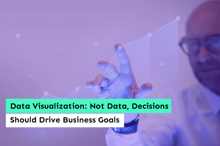
Data Visualization: Not Data, Decisions Should Drive Business Goals
Believe it or not, this is the age of data visualization. Analysts and Power BI consultants now have a unique approach to data. In today’s age of big data, data analysis is a must-have and makes great sense in the business world....