Travel services industry market landscape: trends and patterns
- Industry: Travel
- Country: USA
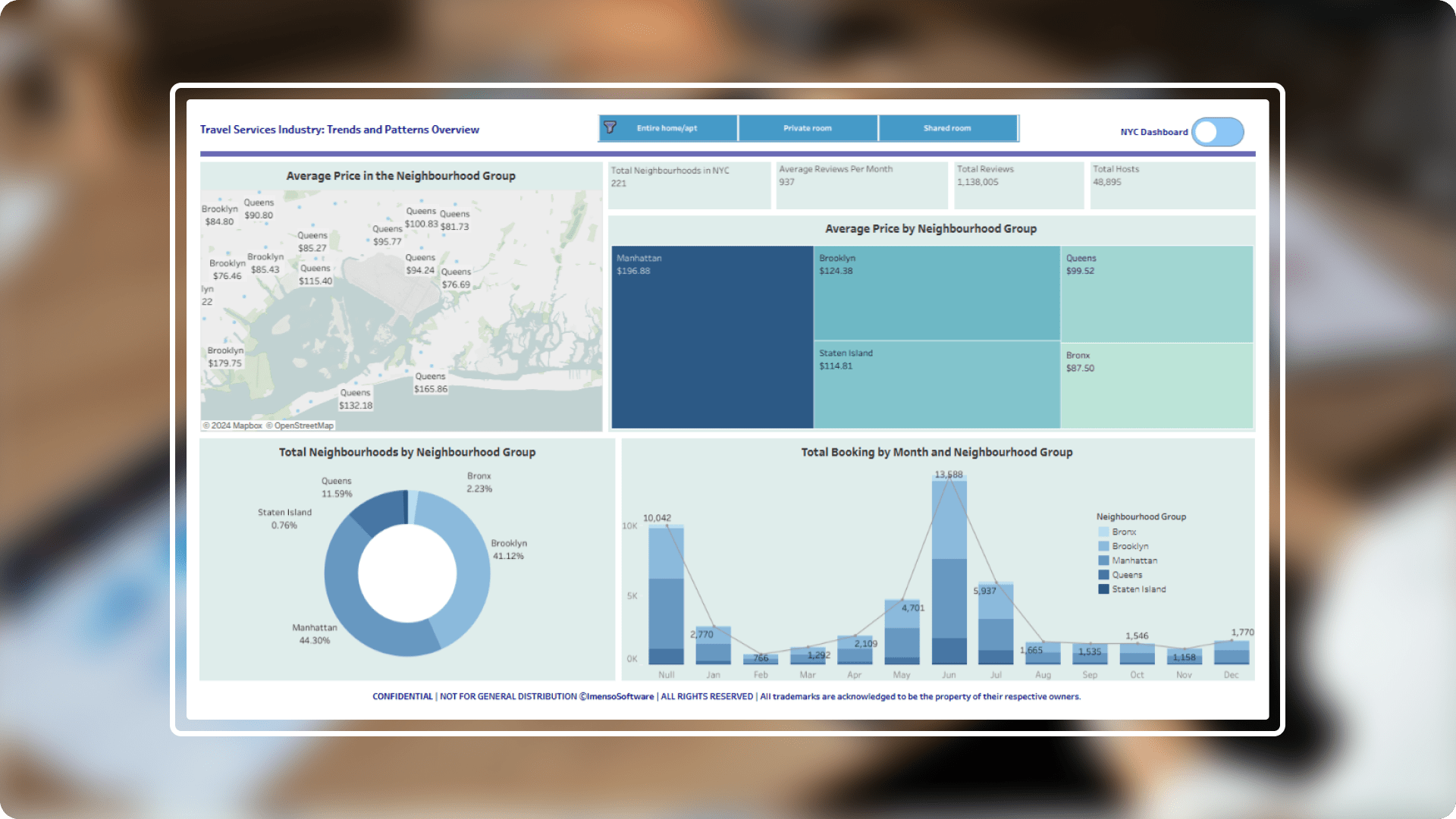
The primary objective of this project was to analyse Travel listings in New York City to gain insights into pricing, booking trends, and host performance across different neighbourhoods. By leveraging Tableau's powerful data visualization capabilities, the project aimed to present complex data in an easily understandable format, enabling stakeholders to make data-driven decisions.
The core challenges
- Data complexity: The dataset contained numerous variables, including neighbourhood group, room type, price, and reviews, which required effective organization and presentation to extract meaningful insights.
- Diverse visualization needs: The project demanded multiple types of visualizations, such as heat maps, geographic maps, and KPI cards, to address different analytical questions.
- User navigation: Creating a user-friendly interface with intuitive navigation was essential to ensure users could easily explore the data across different dimensions.
SolutionIn order to analyse Travel NYC data and make well-informed decisions, a thorough Tableau dashboard was used as the basis.In-depth information about business success is provided by this dashboard, which enables us to assess important indicators like pricing, occupancy rates, and local trends. By thoroughly examining these factors, we can assess performance against industry norms, enabling us to stay competitive and make data-driven decisions.
-
 Comprehensive dashboard : A comprehensive Tableau dashboard was developed with two primary tabs, "Travel NYC" and "Neighbourhood," centralizing all key data for better decision-making and performance tracking.
 -
 Interactive data exploration with visual appeal: The dashboard offers an interactive and visually engaging experience, allowing users to explore data across multiple dimensions such as occupancy rates, pricing trends, and neighbourhood comparisons.
 -
 Detailed insights with neighbourhood tab : The "Neighbourhood" tab provides granular insights into Travel listings across different NYC neighbourhoods, helping users identify patterns and trends based on location.
 -
 Enhanced user experience for strategic decisions: This Tableau dashboard supports data-driven decision-making by offering clear, actionable insights, enabling stakeholders to make informed choices and stay competitive in the evolving hospitality market.
Integration.
Equipped with a variety of
data sources.
The Tableau dashboard was integrated with existing data infrastructure using Tableau Server. When performing data integration, the data sources used in Travel Dashboard include:
- SQL Server
- MySQL Server
- Excel
- CSV

Customization.
We go beyond just charts.
To enhance user experience, the dashboard features customized navigation buttons for effortless switching between the 'Travel NYC' and 'Neighborhood' tabs. Filters and interactive elements allow users to explore data in depth, such as by room type or neighborhood group.
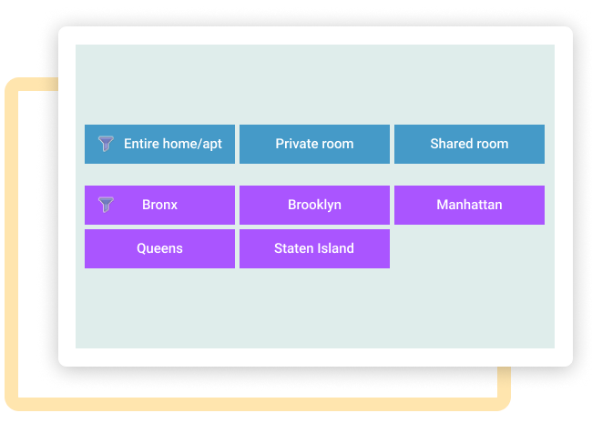
Dynamic filtering
Allow users to filter data based on specific criteria (e.g. neighbourhood, room type, price range) to explore subsets of the data.
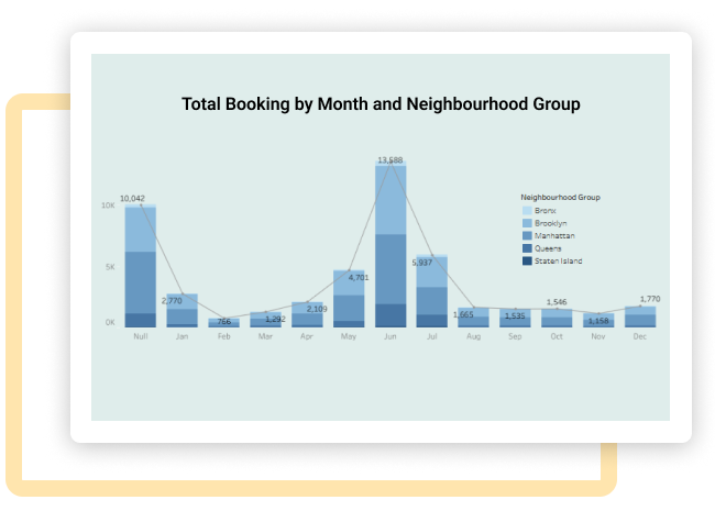
Trend analysis
Incorporate trend lines or annotations to highlight significant changes in average prices, booking volumes, or other metrics over time.
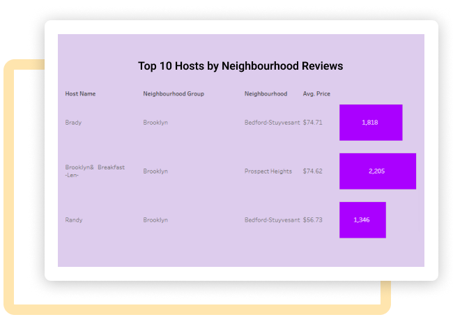
Comparative analysis
Allow users to compare data across different time periods, neighbourhoods, or room types to identify patterns and anomalies.
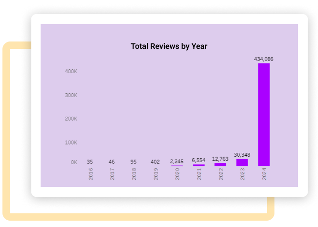
Predictive analytics
Explore the possibility of using forecasting techniques to predict future trends in Travel prices or booking activity.
Enhancement.
By adding useful features.
The project prioritized future-proofing the dashboard, enabling easy updates and extensions. Visualizations were designed to integrate new data seamlessly, with potential for future enhancements like predictive analytics and customer feedback integration.
Tooltips
Provide clear tooltips or explanations for each chart element to help users understand the data and visualizations.
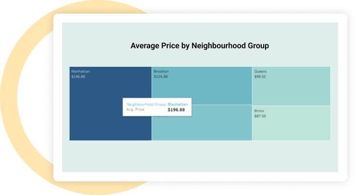
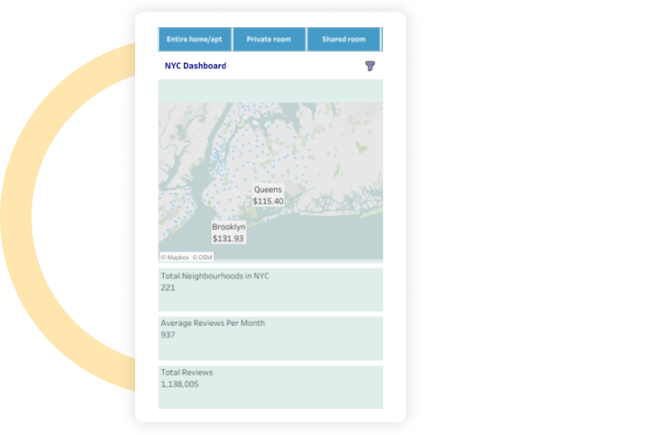
Responsive design
Optimize the dashboard for different screen sizes and devices to ensure a seamless user experience.
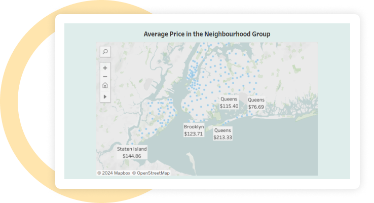
Interactive map
Allow users to zoom in on specific neighbourhoods to see more detailed information about average prices and booking activity.
Comparative chart
Create a chart to compare the average prices of different room types within each neighbourhood group.
Explore more.
Additional features.
Improving the user experience with customized UI.Improved the visual layout, adding obvious navigational elements, and making most of the interactive features that are necessary to improve accessibility and functionality.

Key performance indicators. Used a wide range of KPIs to assess and improve the Tourism industry's overall performance and productivity in a methodical manner.
Conditional formatting. Utilised conditional formatting techniques to enhance insight and clarity in complex datasets by dynamically highlighting important data points.
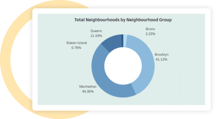
Export preferred charts/KPI . Key visualizations, such as the heat maps, donut chart, and KPI cards, were made exportable to allow stakeholders to include them in reports or presentations.
