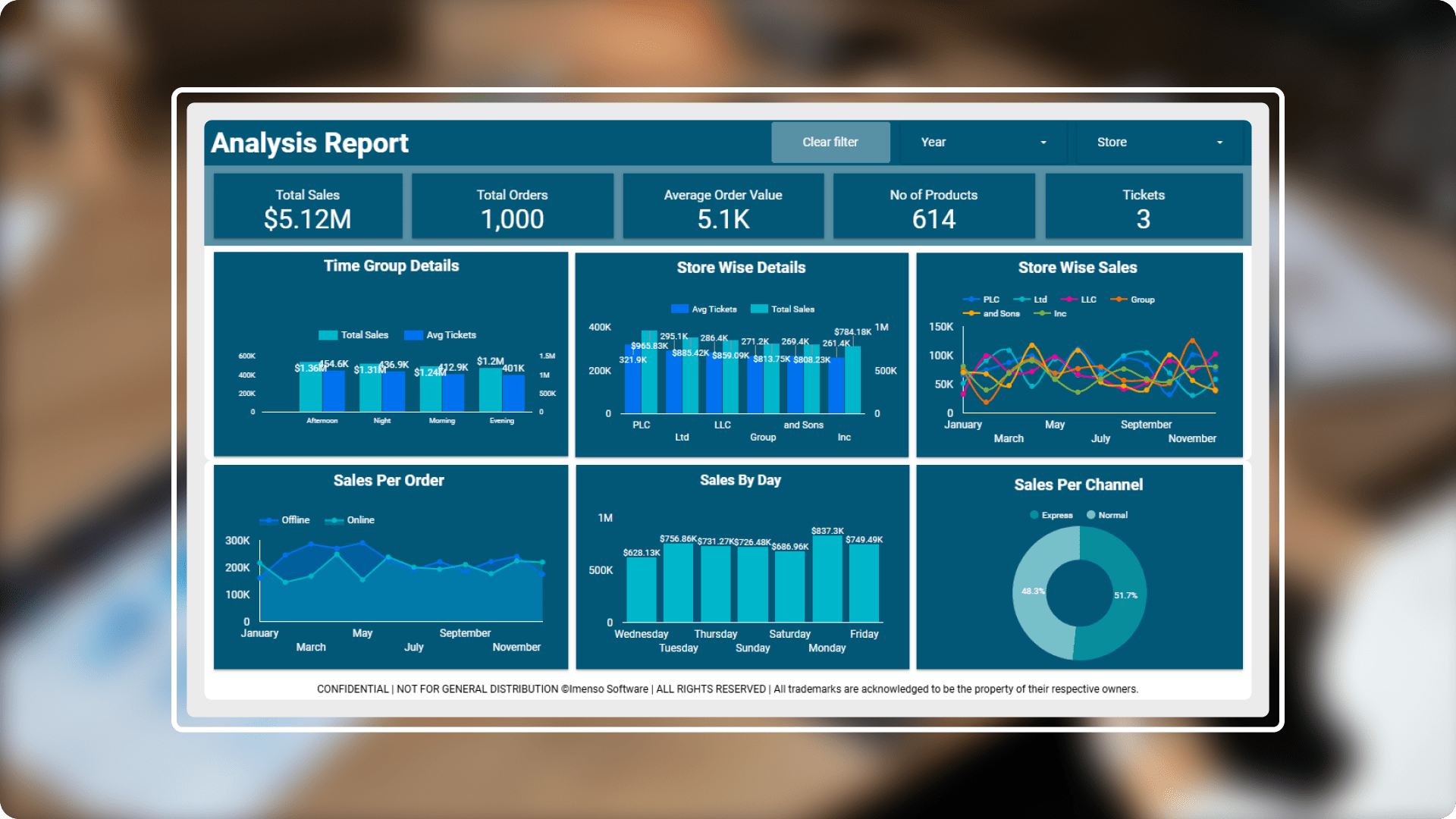
Retail analytics: insights for sales and inventory optimization.
- Industry: eCommerce
- Country: USA
This enables organisations to achieve detailed insights, segment performance by time and store, channel specific insights, regional performance and visualization, product specific trends and enhance decision making.
The core challenges
- Data integration: Integrating data from multiple sources, such as Excel spreadsheets, Google Sheets, Google Ads, Google Analytics, and other Google Marketing Platform products can be complex. We transformed and consolidated the data to overcome this challenge.
- Usability and user adoption: Improved usability and driving user adoption of an analysis dashboard requires a strong focus on simplicity, customization, user education, and continuous improvement. So, we have created a dashboard that is intuitive, responsive, and tailored to user needs, you ca1n enhance user satisfaction and engagement, leading to higher adoption rates.
- Performance enhancement: To enhance the performance of an analysis dashboard, focussed on optimizing data handling, improving server-side processing.
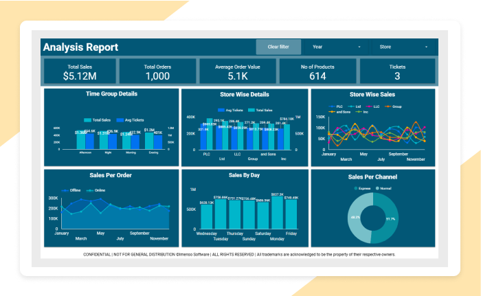
SolutionWe have developed a cutting-edge data visualization dashboard specifically for the Retail sector, designed to present complex operational data in a clear and intuitive manner. This solution includes a comprehensive set of charts and visualizations tailored to analysis and sales data, enabling professionals to easily analyse and interpret critical information.
-
 Enhanced user interface: Enhanced the UI of an analysis dashboard revolves around creating a clean, intuitive design with a focus on usability, readability, and performance. Ensured the interface is responsive, visually engaging, and provides meaningful, actionable data that is easy to interpret.
 -
 Real-Time data integration: If the business requires real-time insights (e.g. for e-commerce or operations), enable real-time data synchronization. You can connect to real-time data sources (such as Google Analytics for web traffic, or CRM systems) to provide live insights.
 -
 Performance optimizations: Review query performance to avoid slowdowns, especially if working with large datasets or complex calculations. SQL optimizations or data aggregation can improve performance, ensuring a smooth experience for end users.
 -
 Embedded reports: Embedded reports in an analysis dashboard enhance user experience by providing detailed, interactive, and customizable insights without requiring users to leave the dashboard.
Integration.
Equipped with a variety of
data sources.
Organizations may increase decision-making, data accessibility, workflow efficiency, and process streamlining by integrating. We used the following integration capabilities to generate this report:
- Google Sheets
- Excel Spreadsheets
Customization.
How we played with charts?
In order to effectively display the data, we did more than just add charts; instead, we gave each one a unique design that served its intended function.
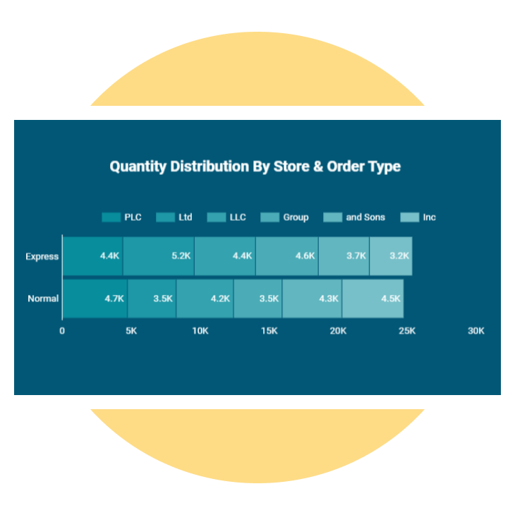
Conditional formatting
Applied some formatting to the visuals like altering the background and applied pubs/bars.
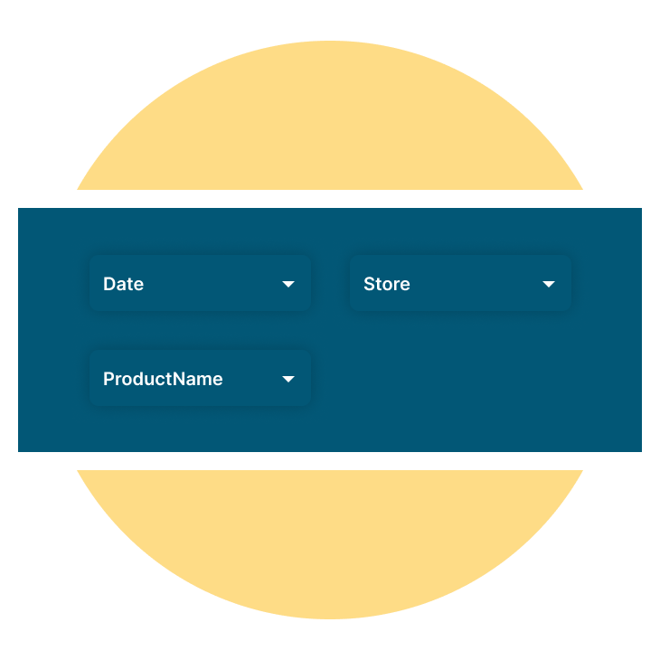
Slicers
Created a slicer where we included multiple values, ticking directly and cross highlighting on visual. The types of slicers used are Date, Store and Product Name slicer. According to our requirement we can choose the slicer selection
Button
Created a button to clear all the filters when the filters are selected manually.
Enhancement.
By adding useful features.
Dynamic visualization techniques
Adding different kinds of charts, like Line and Combo chart, Column chart, Pie, Slicers, Table chart, Tree map, Bubble map and Cards, makes the dashboard look better and makes the user experience more interesting and immersive.
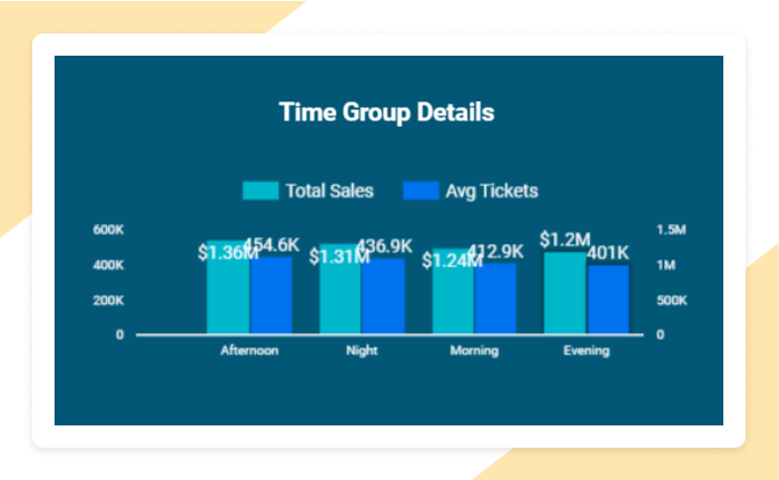
Combo chart
This Chart represents the Total Sales and Average Tickets for each time group.
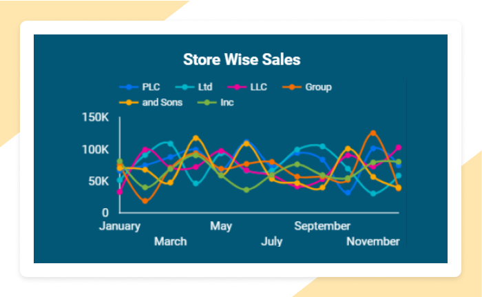
Line chart
This Chart represents the Total Sales across different Stores by month.
Explore more.
Additional features.

Key performance measurements. Key performance measurements (KPIs) for an analysis dashboard are crucial for evaluating its effectiveness in delivering insights and facilitating decision-making.
Collaborative features. Add the ability for multiple users to comment or annotate directly on the dashboard. This fosters collaboration between departments, as team members can provide context or ask questions directly within the dashboard.
Export preferred charts/KPIs. With the export feature, users can easily clean up their data and save it. There are several methods to export a BI report. Here's a list of common export methods: PDF, Power Point, Excel, CSV, Web, Service API
