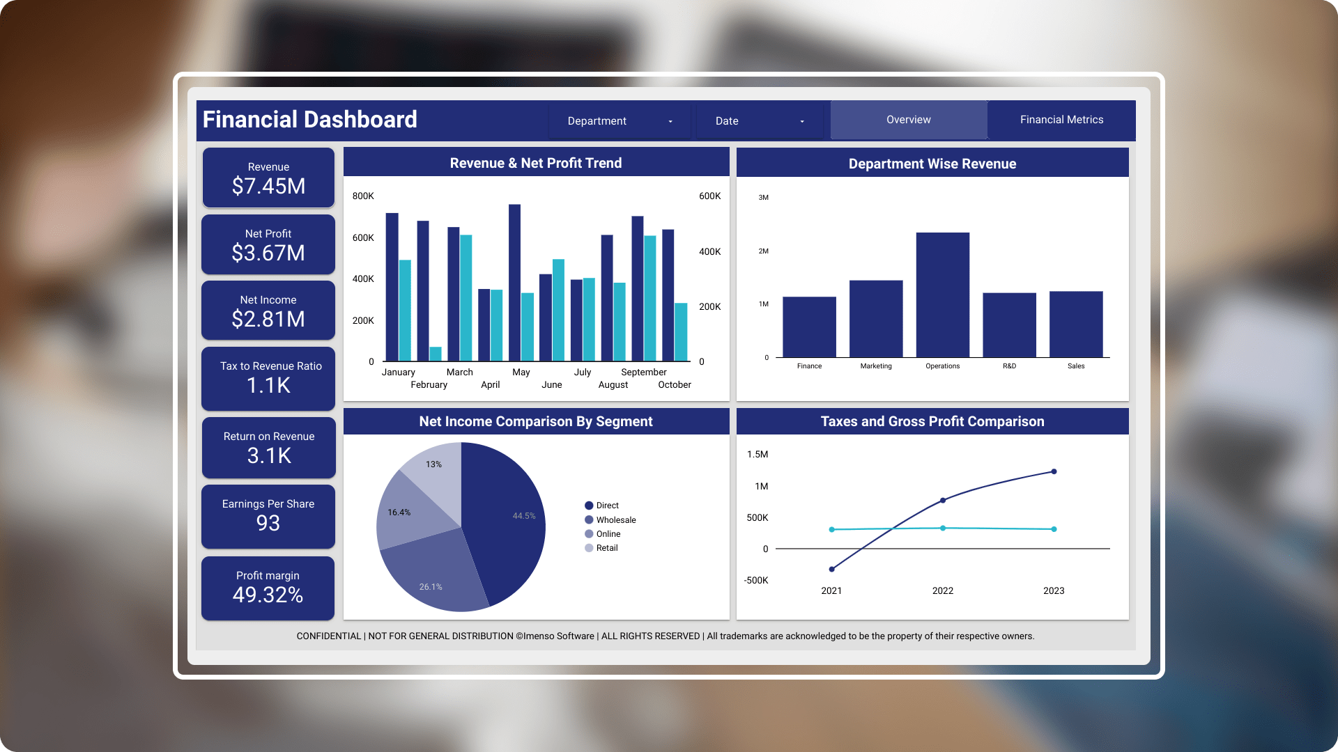
Deep dive into KPI & Metric-driven financial dashboard.
- Industry: FinTech
- Country: USA
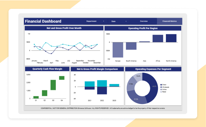
The main aim of Financial Dashboard is to provide a comprehensive overview of company’s financial performance across several key metrics. This enables organisation to achieve revenue and profit tracking, profitability analysis, departmental performance, product analysis, record count and strategic decision-making.
The core challenges
- Data integration: Integrating data from multiple sources, such as Excel spreadsheets, Google Sheets, Google Ads, Google Analytics, and other Google Marketing Platform products can be complex. Cleaned and processed data before bringing it into Looker Studio, using tools like Google Sheets for transformations and to ensure data quality.
- Data accuracy and quality: Implemented automated data validation and quality checks at the data source level, and established clear guidelines for data entry and handling.
- Filter functionality and user interactivity: Implemented interactive filters in a way that users can easily slice the data by time periods, departments, or other dimensions, without causing the dashboard to slow down.
- Maintaining security and access control: Implemented robust access control measures by leveraging Looker Studio's permissions and restricting access based on user roles. Ensure that financial data is only visible to those with the appropriate permissions.
Solution We have developed a cutting-edge data visualization dashboard specifically for the financial sector, designed to present complex operational data in a clear and intuitive manner. This solution includes a comprehensive set of charts and visualizations tailored to Sales data, enabling professionals to easily analyse and interpret critical information.
-
 Enhanced user interface: The user interface of financial dashboard can make it more intuitive, engaging and effective for users by performance optimization, accessibility that is not only visually attractive but also highly functional and user-friendly.
 -
 KPIs misalignment: Align KPIs with business goals and make sure they are actionable. Regularly review and update KPIs to ensure they remain relevant as the business evolves.
 -
 Complexity in data aggregation: Establish clear rules for data aggregation and ensure consistency in metrics across different data sources. Use ETL (Extract, Transform, Load) processes to standardize data before feeding it into the dashboard.
 -
 Embedded reports: Embedded reports allow for greater flexibility, real-time updates, and improved user experience.
Integration.
Equipped with a variety of
data sources.
Organizations may increase decision-making, data accessibility, workflow efficiency, and process streamlining by integrating. We used the following integration capabilities to generate this report:
- Google Sheets
- Excel Spreadsheets

Customization.
How we played with charts?
In order to effectively display the data, we did more than just add charts; instead, we gave each one a unique design that served its intended function.
Slicers
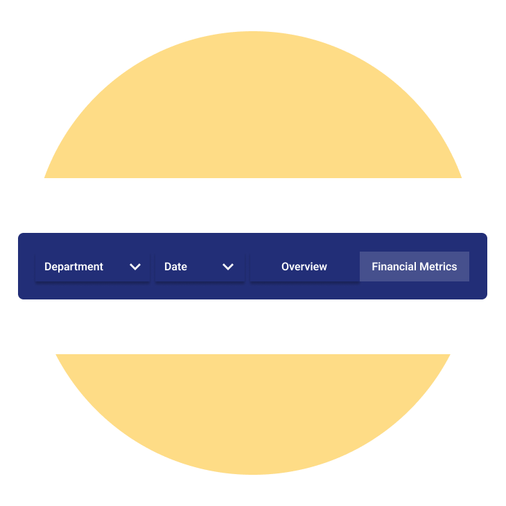
Created a slicer where we included multiple values, ticking directly and cross highlighting on visual. The types of slicers used are Date and Department slicer. According to our requirement we can choose the slicer selection
Waterfall chart
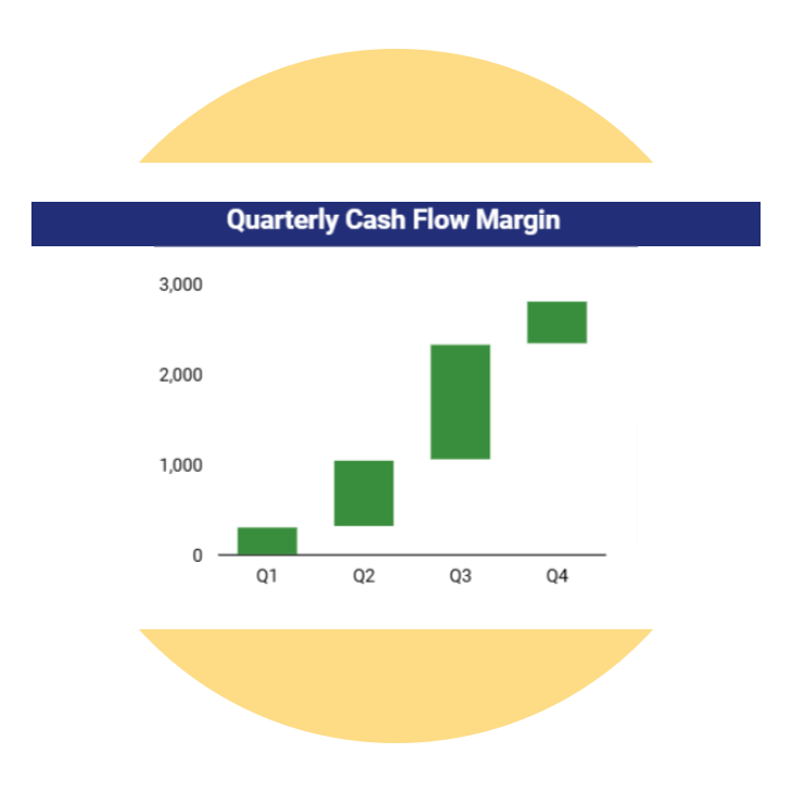
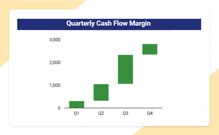
Each bar in the chart represents the cash flow margin for specific quarter. The upward trend shows a progressive increase in cash flow margin across quarters.
Stacked combo chart
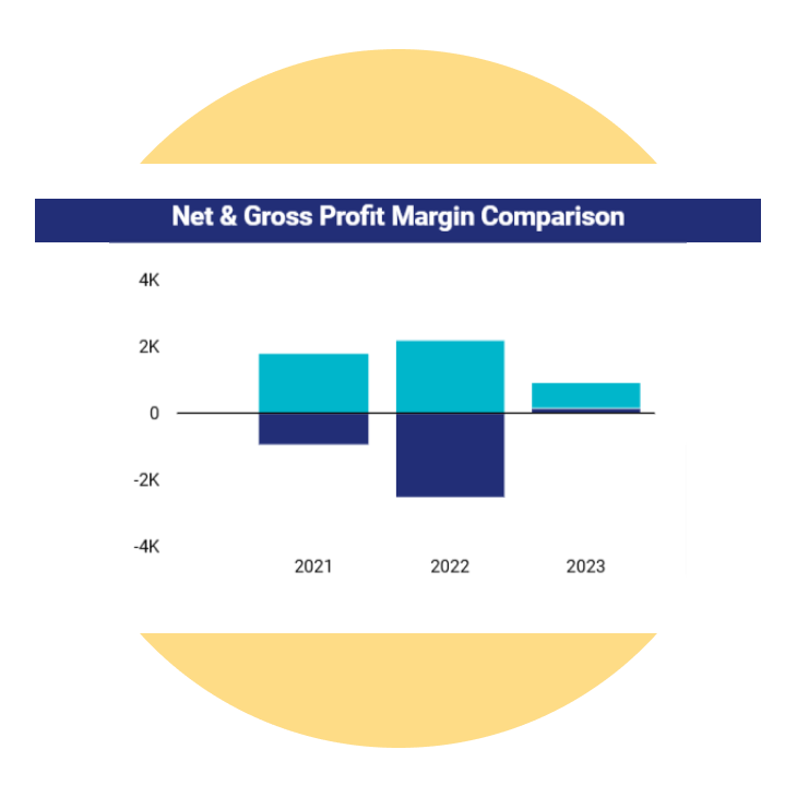
The Chart shows the positive and negative values representing net and gross profit margins for each year.
Enhancement.
By adding useful features.
Advanced data visualizations
Adding different kinds of charts, like line and column Chart, bar chart, stacked Column chart, pie, Slicers, matrix chart, Bubble map and cards, makes the dashboard look better and makes the user experience more interesting and immersive.
Conditional formatting
Applied Conditional formatting to the chart to show the positive values in green colour and negative values in red colour.
Page navigation
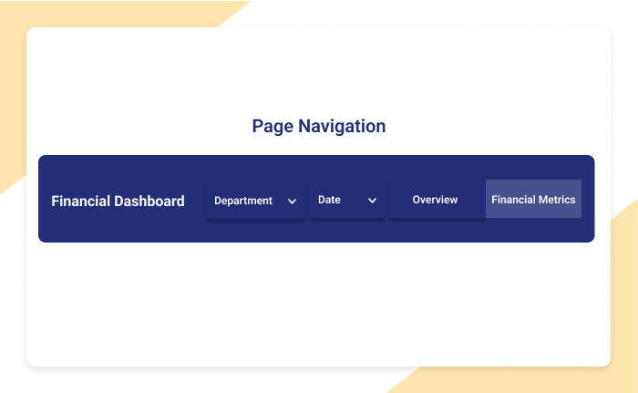
User can switch from source to destination page through Page Navigation.The highlighted option in the menu likely takes the user to a section where they can view financial data and performance metrics.
Explore more.
Additional features.
Caching for faster load times. If the dashboard is using large datasets, implement caching strategies to store frequently accessed data temporarily, improving load times.
Optimized query performance. Review query performance to avoid slowdowns, especially if working with large datasets or complex calculations. SQL optimizations or data aggregation can improve performance, ensuring a smooth experience for end users.
Export preferred charts/KPIs. With the export feature, users can easily clean up their data and save it. There are several methods to export a BI report. Here's a list of common export methods: PDF, Power Point, Excel, CSV, Web, Service API
