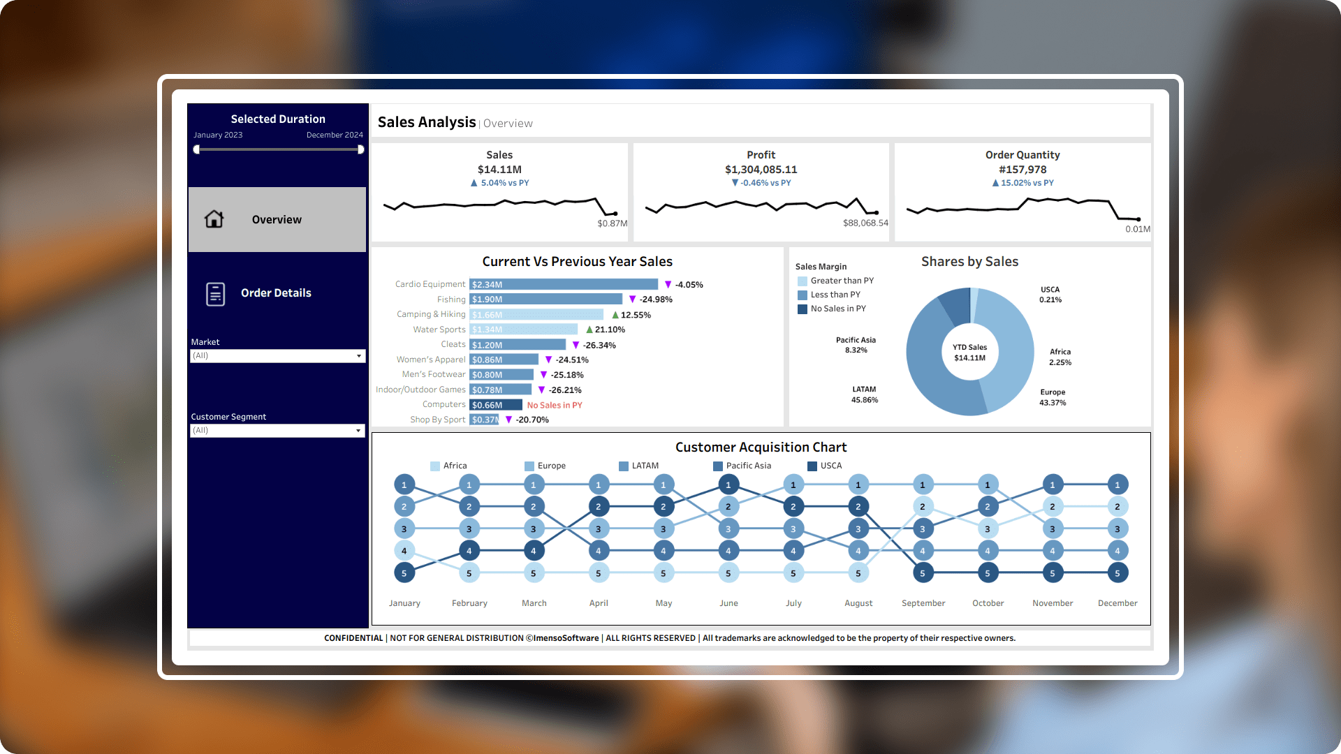
Sales Analytics - Revenue and profit insights across sectors.
- Industry: eCommerce
- Country: Global
The objective of this project was to design a sales analysis dashboard in Tableau that delivers an in-depth view of key business metrics. It offers insights into sales performance, profit trends, order volumes, and customer acquisition patterns. This dashboard enables users to easily track and analyse the data for informed decision-making.
The core challenges
- Data management and complexity: The challenges were managing a large dataset with multiple sales categories and regional divisions, complicating data management and visual representation. This was tackled by cleaning, aggregating, and processing the data within Tableau, utilizing data blending and calculated fields to streamline insights.
- Market segmentation: There was a need to break down sales by region and customer segment to understand performance across different markets. I addressed this by implementing a pie chart showing "Shares by Sales" with filters for region and customer segment, facilitating easy tracking of market performance.
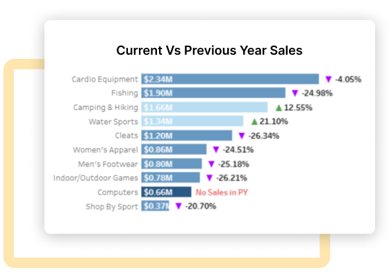
- Comparative analysis: We encountered the requirement to compare year-to-date (YTD) sales with previous year-to-date (PYTD) data for trend analysis. This was resolved by developing a YTD sales vs. PYTD bar chart to show category-wise growth and decline.
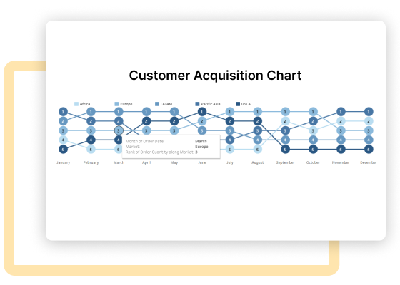
- Customer acquisition visualization: There was a challenge of visualizing customer acquisition trends over time for different regions. I tackled this by creating a customer acquisition flowchart that displays regional customer acquisition over the months, enabling easy tracking of growth trends.
Solution Sales Analysis improves operational efficiency by implementing efficient data processing and providing customized market views. This enables businesses to perform accurate comparative analysis, while also offering a clear customer acquisition flowchart, leading to reduced manual errors and optimized processes.
-
 Sales margin arrows for quick insights: Arrow symbols show whether sales margins are increasing or decreasing, helping users instantly spot areas of growth or decline. Upward arrows represent margin improvements, while downward arrows signal reductions, making it easy to understand profitability at a glance.
 -
 Simple navigation for easy exploration: The dashboard includes navigational buttons and tabs, allowing users to switch between sections like overall sales, customer segments, and regional data. This setup lets users find the data they need without getting lost in too many details.
 -
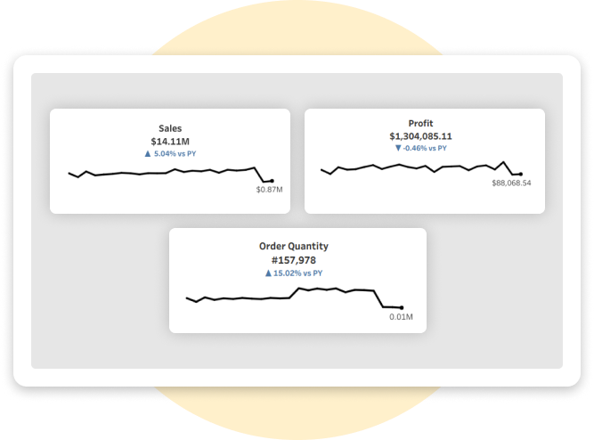
 Interactive tooltips and KPI cards: Tooltips provide extra details when hovering over data points, giving more information without extra clicks. Key Performance Indicators (KPIs) are summarized in cards, highlighting important metrics like total sales and profit for quick reference.
 -
 Customer growth tracking by region: A flowchart shows new customer numbers by region each month, helping the team monitor customer growth over time. This chart reveals which regions are seeing the most new customers, supporting regional strategy planning.
Integration.
Equipped with a variety of
data sources.
The Tableau dashboard was integrated with existing data infrastructure using Tableau Server. When performing data integration, the data sources used in Sales Dashboard include:
- SQL Server
- MySQL Server
- Excel
- CSV

Customization.
How we played with charts?
Tailored visualizations
Specific visualizations were tailored to meet the unique needs of the sales department. For example, pie charts were used for sales shares by region, while bar charts displayed YTD vs. PYTD sales.
Interactive features
Interactive features were implemented, allowing different levels of users to access the most relevant data. Senior management could access high-level insights while sales teams focused on specific regional performance.
Enhancement.
By adding useful features.
Interactive filters
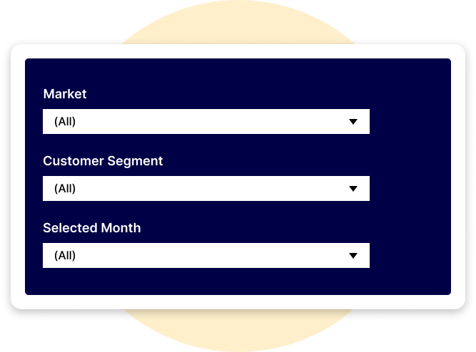
Interactive filters were added, enabling users to switch between different regions and customer segments easily.
KPI Cards for key metrics
Key metrics like sales, profit, and order quantity are displayed in dedicated KPI cards for immediate insight.
Explore more.
Additional features.
Dynamic filters and parameters. Dynamic filters and parameters were utilized to allow users to explore different aspects of the data dynamically.
Custom tooltips. Custom tooltips offer detailed views of data points with additional context, enhancing user experience.
Export preferred charts/KPIs. With the export feature, users can efficiently extract and save their data in a variety of formats, making it easy to share and analyse.There are several methods to export a Tableau report. Common methods for exporting data include the following options: PDF, Power Point, Excel, CSV, Tableau Workbook, Images
