Power BI Dashboard Best Practices: Comprehensive & Interactive Examples
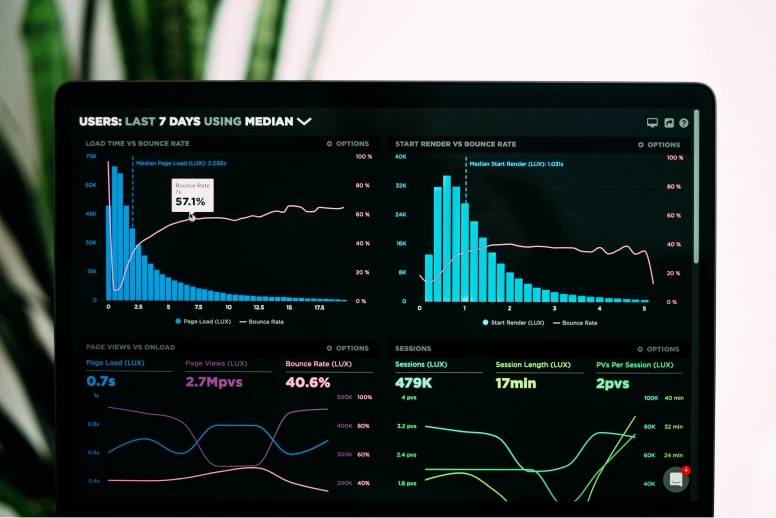
Are you tired of drowning in a sea of data, desperately searching for insights that seem to elude you? Wondering how to make sense of those complex spreadsheets and transform them into captivating visual stories? Fear not, for we have the answer: Power BI dashboards. In this blog, we’ll guide you through the art of building comprehensive and interactive dashboards with Power BI. We’ll unravel the mysteries, reveal best practices for Power BI, and provide real-world examples that will have your audience eagerly devouring your data-driven tales. From defining clear objectives to implementing drill-down functionality and leveraging interactive filters, we’ll equip you with the tools to captivate, inform, and inspire.
Join us on this epic adventure as we transform your data from a jumble of numbers into a captivating symphony of visuals. Get ready to wield the power of data and become a dashboard virtuoso. It’s time to conquer the world of comprehensive and interactive dashboards with Power BI dashboard examples. Let’s dive in and unleash the full potential of your data
Define Clear Objectives:
Before diving into the dashboard design process, it is crucial to define clear objectives. Defining clear objectives is a critical step in the process of building comprehensive and interactive dashboards with Power BI. Let’s delve deeper into this aspect and explore why it is essential and how to effectively define objectives for your dashboard project.
1. Understand Stakeholder Requirements:
To define clear objectives, it is crucial to understand the needs and requirements of the stakeholders who will be using the dashboard. Engage in thorough discussions and gather insights from key stakeholders, such as executives, department heads, analysts, or end users. Understand their goals, challenges, and the specific insights they seek from the data. For more examples of effective Power BI visualizations
2. Identify Key Metrics and KPIs:
Once you have a grasp of the stakeholders’ requirements, identify the key metrics and Key Performance Indicators (KPIs) that align with their objectives. These metrics should be measurable and provide a clear understanding of performance or progress toward specific goals. For example, in a sales dashboard, key metrics might include revenue, conversion rates, customer acquisition cost, or average order value.
3. Prioritize Relevance and Actionability:
Not all metrics are equally important or actionable. Prioritize the metrics that are most relevant to the stakeholders’ objectives and have a direct impact on decision-making. Consider the critical aspects of the business or process you are analyzing and focus on metrics that can drive actionable insights and guide improvements.
4. Consider the Audience and Use Cases:
Different stakeholders have different roles and responsibilities within an organization. Tailor the objectives of your dashboard to cater to specific audiences and their use cases. For example, executives may require high-level summaries and strategic insights, while analysts might need granular data for in-depth analysis. By considering the audience and their specific needs, you can ensure that the dashboard serves its purpose effectively.
5. Set SMART Objectives:
SMART objectives are specific, measurable, achievable, relevant, and time-bound. When defining objectives for your dashboard, ensure they meet these criteria. Specificity helps avoid ambiguity, measurability allows for tracking progress, achievability ensures realistic goals, relevance keeps the objectives aligned with stakeholders’ needs, and time-bound nature provides a clear deadline or timeframe for achieving the objectives. For expert guidance in this process, consider reaching out to a Power BI specialist
6. Document and Communicate Objectives:
Once you have defined the objectives, document them clearly and concisely. This documentation serves as a reference point throughout the dashboard development process and helps maintain focus. Additionally, communicate the objectives to all relevant stakeholders to ensure everyone is aligned and understands the purpose and goals of the dashboard.
7. Refine and Review Objectives:
Objectives may evolve as business requirements change or new insights are discovered. Regularly review and refine the objectives of your dashboard to ensure they remain aligned with the evolving needs of the stakeholders. Stay open to feedback and iterate on the objectives as necessary to maximize the value of the dashboard.
Gather and Prepare Data:
To create meaningful dashboards, you need to gather and prepare the right data. Building comprehensive and interactive dashboards with Power BI requires a meticulous approach to gathering and preparing data. Let’s explore the key steps involved in this process:
1. Identify Data Sources:
Begin by pinpointing the relevant data sources for your dashboard, including databases, spreadsheets, and cloud services. Extract and import the data into Power BI using the available data connectors to establish a seamless connection.
2. Clean and Transform Data:
Ensure data accuracy and consistency by cleaning and transforming the data. Address missing values, eliminate duplicates, and perform data validation. Power BI’s robust data transformation capabilities empower you to efficiently shape, merge, and form.
3. Establish Relationships:
Enable meaningful analysis and visualization by establishing relationships between tables. Identify common fields or keys and define relationships using Power BI’s intuitive relationship editor. This allows for comprehensive and interconnected visualizations within your dashboard.
4. Create Calculated Columns and Measures:
Enhance the analytical capabilities of your dashboard by leveraging Power BI’s DAX language to create calculated columns and measures. Calculated columns derive new values based on existing data, while measures perform aggregations and calculations. These elements provide valuable insights and context for effective visualization. To fully utilize these features, working with a Power BI expert can help you optimize your approach and achieve the best results
5. Optimize Data Model:
Optimize your data model to ensure optimal performance as your data grows. Utilize techniques such as partitioning, compression, and aggregations to reduce data size and enhance query performance. Power BI offers features like DirectQuery and Import mode, which can be tailored to your specific needs and data volume.
6. Schedule Data Refresh:
Keep your dashboard up to date with the latest data by establishing a data refresh schedule. Power BI allows you to automate data refreshes at predefined intervals. Choose between on-premises gateways or cloud-based services depending on your data source.
7. Ensure Data Security and Privacy:
Implement robust data security measures to control access and ensure compliance with privacy regulations such as GDPR. Power BI offers features like row-level security and Azure Active Directory integration to enforce data access restrictions based on user roles and credentials.

Choose the Right Visualizations:
Choosing the right visualizations is crucial for creating comprehensive and interactive dashboards with Power BI. Let’s explore this topic further:
1. Understand Data and Insights:
Before selecting visualizations, gain a deep understanding of your data and the insights you want to convey. Analyze the nature of the data, including its type (numerical, categorical, etc.), relationships, and patterns. This understanding will guide you in choosing visualizations that effectively represent and communicate the key findings.
2. Consider Data Types and Dimensions:
Different data types and dimensions require specific visualizations. For numerical data, options like line charts, bar/column charts, scatter plots, or heat maps can be effective. Categorical data can be presented using pie charts, stacked bar/column charts, or treemaps. Geospatial data can be visualized with maps and choropleth maps. Consider the nature of your data to select appropriate visualizations.
3. Emphasize Comparison and Trends:
Visualizations that emphasize comparisons and trends can be powerful in conveying insights. Bar/column charts, line charts, and area charts are effective for comparing values over time or across different categories. Sparklines and bullet graphs can highlight trends and provide quick insights at a glance. Utilize these visualizations to reveal patterns and make data-driven decisions.
4. Use Interactive Elements:
Power BI offers a range of interactive elements that enhance user engagement and exploration. Utilize slicers, filters, and drill-down functionality to allow users to interact with the data. Implementing interactive elements empowers users to customize the dashboard based on their specific needs and enables deeper analysis and discovery.
5. Incorporate Data Hierarchies:
Visualizations that incorporate data hierarchies can provide a comprehensive view of information. Utilize hierarchical visualizations like tree maps, sunburst charts, or stacked charts to showcase the relationship between categories and subcategories. This allows users to navigate through different levels of data and uncover insights at various levels of granularity.
6. Leverage Color and Formatting:
Color coding and formatting techniques can enhance the clarity and visual appeal of your dashboards. Use consistent color schemes, meaningful color choices, and appropriate legends to ensure that visualizations are easy to interpret. Pay attention to labels, titles, and annotations to provide context and guide users through the dashboard.
7. Consider the Storytelling Aspect:
Effective visualizations tell a story and guide the viewer toward understanding the data. Structure your dashboard in a logical flow, leading the user from one visualization to another to build a cohesive narrative. Arrange visualizations in a way that supports the objectives of your dashboard and guides users toward the desired insights and conclusions.
Design a Clean and Intuitive User Interface:
Designing a clean and intuitive user interface (UI) is crucial for building comprehensive and interactive dashboards with Power BI. Let’s explore some key principles and best practices to achieve an effective UI design:
1. Keep it Simple and Minimalistic:
Strive for simplicity in your UI design. Avoid cluttering the dashboard with unnecessary elements. Use a minimalist approach to keep the focus on the data and insights. Keep the layout clean, use ample white space, and declutter visuals to ensure a clear and uncluttered user experience.
2. Consistency is Key:
Maintain consistency in your UI design to create a cohesive and intuitive experience. Use consistent color schemes, fonts, icons, and visual styles throughout the dashboard. Consistency helps users understand the interface quickly, promotes usability and ensures a seamless user experience.
3. Prioritize Information Hierarchy:
Organize information logically and hierarchically. Place important and frequently accessed elements prominently. Use visual cues such as font size, color, and positioning to guide users’ attention and highlight critical information. Group related elements together and ensure a logical flow to support user understanding and navigation.
4. Use Intuitive Navigation:
Implement intuitive navigation to help users explore and interact with the dashboard effortlessly. Use clear and descriptive labels for navigation elements like buttons, menus, and links. Utilize intuitive icons and tooltips to provide additional context and guidance. Consider incorporating breadcrumbs or a navigation menu to facilitate easy movement between different sections or views within the dashboard.
5. Provide Context and Guidance:
Offer contextual information and guidance to assist users in understanding and interpreting the data. Use titles, subtitles, and annotations to provide clear explanations and insights. Add tooltips or hover-over information to provide additional details on specific data points or visualizations. Well-placed and concise instructions can enhance the user’s understanding and engagement.
6. Responsive and Device-Friendly Design:
Design your dashboard to be responsive and adaptable to different screen sizes and devices. Ensure that the dashboard elements scale appropriately and remain accessible on various devices, including desktops, tablets, and mobile devices. Responsive design ensures a consistent and optimal user experience across different platforms.
7. Test and Iterate:
Regularly test and gather user feedback to iterate and improve your UI design. Conduct usability tests, observe user interactions, and gather feedback to identify areas of improvement. Iteratively refine your design based on user insights, ensuring that the UI is user-friendly and aligns with users’ needs and expectations.
Implement Drill-Down Functionality:
Implementing drill-down functionality in your Power BI dashboard enhances user interactivity and allows for deeper exploration of data. Let’s explore how to incorporate this feature effectively:
1. Identify Drill-Down Opportunities:
Analyze your data and identify areas where drill-down functionality can provide valuable insights. Look for hierarchies or dimensions within your data that can be expanded to reveal more detailed information. For example, if you have a geographical dataset, you can drill down from a country-level view to a regional or city-level view.
2. Define Drill-Down Levels:
Determine the levels at which users can drill down in your dashboard. These levels should align with the hierarchies present in your data. For instance, if your data includes time, you can define drill-down levels such as year, quarter, month, and day.
3. Choose Appropriate Visualizations:
Select visualizations that support drill-down functionality effectively. For hierarchical data, options like treemaps, sunburst charts, or nested column/bar charts work well. These visualizations allow users to navigate through different levels of detail by clicking or interacting with specific data points.
4. Enable Interactive Elements:
Implement interactive elements, such as buttons, icons, or clickable areas, to initiate the drill-down action. Users should be able to easily identify and interact with these elements to explore data at a deeper level.
5. Provide Clear Navigation:
Ensure that users can easily navigate between different drill-down levels. Include intuitive navigation controls, such as breadcrumbs, hierarchical menus, or back buttons, to allow users to move back and forth between different levels of detail.
6. Display Contextual Information:
As users drill down into more granular data, provide contextual information to help them understand the significance of the displayed data. Include informative titles, labels, and annotations that provide insights and explanations for the specific level of detail being viewed.
7. Optimize Performance:
Consider the performance implications of implementing drill-down functionality, especially if dealing with large datasets. Use techniques like data aggregation, caching, or pre-calculating values to ensure a smooth and responsive user experience.
8. Test and Iterate:
Test the drill-down functionality thoroughly to ensure it works as expected and provides a seamless user experience. Gather user feedback and iterate based on their input to continuously improve the implementation.
Leverage Interactive Filters and Slicers:
Leveraging interactive filters and slicers in your Power BI dashboard enhances user engagement and allows for dynamic data exploration. Here’s how you can effectively incorporate these features:
1. Identify Filterable Dimensions:
Identify the dimensions within your data that can be used as filters. These dimensions should provide meaningful and relevant categories or attributes that users can interact with. For example, if your data includes sales data, filterable dimensions could include product category, region, or time.
2. Choose Appropriate Filter Controls:
Select the appropriate filter controls based on the nature of your data and the user experience you want to create. Power BI offers various types of filter controls, including dropdown lists, checkboxes, sliders, and date pickers. Choose the control that best suits your data and the ease of interaction for users.
3. Place Filters and Slicers Strategically:
Strategically position the filters and slicers in your dashboard to ensure easy access and visibility. Place them prominently, either as a separate panel or integrated within the visualizations themselves. Ensure that users can quickly identify and interact with the filters without disrupting the overall dashboard layout.
4. Enable Multi-Select and Clear Selection Options:
Allow users to select multiple values within a filter or slicer. This enables them to analyze and compare data across different categories simultaneously. Additionally, provide a “Clear Selection” option to reset the filters and slicers easily, allowing users to start anew.
5. Utilize Cascading Filters:
Implement cascading filters to create a hierarchical filtering experience. Cascading filters dynamically update based on the selection made in a higher-level filter. For example, if a user selects a specific region, the cascading filter for cities will update to show only the cities within that region.
6. Sync Filters Across Visualizations:
Sync filters across multiple visualizations to maintain consistent filtering behavior and ensure that the selected values apply to all relevant visuals. By examining case studies of Power BI dashboards , you can see how this approach helps users analyze data in different visualizations while maintaining the same context
7. Provide Visual Feedback:
Provide visual feedback to indicate the active filters or slicer selections. This helps users understand the current state of filtering and supports their exploration by showing the applied filters at a glance.
8. Test and Refine:
Test the interactive filters and slicers extensively to ensure they function as intended and provide a seamless user experience. Gather feedback from users and iterate based on their input to improve the usability and effectiveness of the filtering functionality.
Utilize Power BI Custom Visuals:
Power BI offers a wide range of custom visuals that can enhance the visual appeal and analytical capabilities of your dashboards. Here’s how you can effectively utilize Power BI custom visuals:
1. Explore the Power BI AppSource:
Visit the Power BI AppSource marketplace to explore the extensive collection of custom visuals available. The marketplace provides a variety of visuals created by both Microsoft and third-party hire Power BI developers. Browse through the different categories and assess the visuals that align with your specific data visualization needs.
2. Evaluate Custom Visuals:
Evaluate custom visuals based on their functionality, aesthetics, and suitability for your data. Consider factors such as the visualization type, interactivity features, ability to handle your data volumes, and compatibility with the Power BI features you plan to use. Read user reviews and check for any additional requirements or dependencies for the custom visual.
3. Install Custom Visuals:
Install the desired custom visuals directly from the Power BI AppSource marketplace. Once installed, the custom visuals will be available in the Visualizations pane of Power BI Desktop. Click on the “Import a custom visual” button to add them to your workspace.
4. Configure and Customize:
Configure the custom visual to suit your specific requirements. Most custom visuals provide a set of formatting options and properties that you can modify to control the appearance and behavior of the visual. Customize colors, fonts, tooltips, and any other relevant settings to align with your dashboard’s overall look and feel.
5. Utilize Advanced Custom Visuals:
Consider advanced custom visuals that go beyond traditional chart types. Power BI offers visuals for geographic mapping, hierarchical data, network analysis, sentiment analysis, and more. These advanced visuals can add depth and complexity to your dashboards, allowing for a richer and more interactive user experience.
6. Leverage Community Visuals:
Engage with the Power BI community and explore visuals created by other users and Power BI developers. Community visuals are often inspired by real-world scenarios and can provide unique insights and functionality. The Power BI community offers a platform to share, discuss, and collaborate on custom visuals, fostering innovation and knowledge exchange.
7. Test and Validate:
Test the custom visuals thoroughly to ensure they work as expected and deliver accurate results. Validate the visuals against your data and perform data quality checks to ensure they integrate seamlessly into your dashboard. Pay attention to performance considerations and evaluate the visuals’ responsiveness, especially when dealing with large datasets.
8. Stay Updated:
Regularly check for updates and new custom visuals in the Power BI AppSource marketplace. Microsoft and third-party developers often release updates and new visuals with enhanced features and bug fixes. Keeping your custom visuals up to date ensures that you have access to the latest functionality and improvements.
Incorporate Data Refresh and Security:
Incorporating data refresh and security measures is essential to ensure that your Power BI dashboards provide accurate and up-to-date information while maintaining data privacy and integrity. Here’s how you can effectively address these aspects:
1. Data Refresh:
Implement a robust data refresh strategy to ensure that your dashboards reflect the most recent data. Consider the following:
- Scheduled Refresh: Set up scheduled refresh to automatically update the data at regular intervals. Power BI supports various data source types and provides options for configuring refresh frequencies based on your specific needs.
- Direct Query: If real-time data is crucial, consider using Direct Query mode instead of importing data. This allows Power BI to query the data source directly, ensuring that the dashboards always display the latest information. For optimal configuration and management, you might need to hire a Power BI developer who can tailor the setup to your specific needs.
- Incremental Refresh: For large datasets, use incremental refresh to update only the new or modified data, minimizing data processing time and improving refresh performance.
2. Data Source Connectivity and Credentials:
Ensure that you establish secure connections to your data sources and configure appropriate credentials. Consider the following:
- Secure Connections: When connecting to data sources, prioritize secure protocols such as HTTPS or SSL to encrypt data transmission and protect it from unauthorized access.
- Data Source Credentials: Implement strong and secure credentials for accessing data sources. Utilize features like service accounts, managed identities, or single sign-on (SSO) to manage authentication effectively.
3. Data Privacy and Compliance:
Maintain data privacy and comply with regulatory requirements by following these best practices:
- Data Encryption: Implement data encryption at rest and in transit to protect sensitive data. Power BI provides options to encrypt data within the service and supports industry-standard encryption protocols.
- Row-Level Security (RLS): Use RLS to restrict data access based on user roles or permissions. RLS allows you to define rules that filter data dynamically, ensuring that users only see the data they are authorized to view.
- Compliance Features: Leverage Power BI’s compliance features, such as data classification labels, sensitivity labels, and information protection policies, to ensure adherence to regulatory requirements such as GDPR or HIPAA.
4. User Access and Authentication:
Manage user access and authentication effectively to maintain data security:
- Role-Based Access Control (RBAC): Implement RBAC to assign appropriate roles and permissions to users within Power BI. This ensures that users can only access and interact with the data and dashboards they are authorized to.
- Multi-Factor Authentication (MFA): Enable MFA for Power BI to add an extra layer of security to user authentication, reducing the risk of unauthorized access. For more advanced security configurations and best practices, consulting with a Power BI consultant can provide valuable guidance.
- Active Directory Integration: Integrate Power BI with your organization’s Active Directory to streamline user management and enforce centralized security policies.
5. Monitoring and Auditing:
Regularly monitor and audit your Power BI environment to detect and address any potential security vulnerabilities:
- Activity Monitoring: Utilize Power BI’s audit logs and activity monitoring features to track user activities, data access, and dashboard usage. This allows you to identify any unusual behavior or potential security incidents.
- Security Alerts: Configure security alerts to receive notifications about suspicious activities or potential breaches in real time. Act promptly to investigate and mitigate any security threats.
Real-World Examples:
Real-world examples of comprehensive and interactive Power BI dashboards can demonstrate the practical applications and benefits of utilizing this powerful data visualization tool. Let’s explore a few examples: For deeper insights, consider exploring our data visualization advisory services
Sales Performance Dashboard:
A sales performance dashboard can provide insights into revenue, customer behavior, and sales team performance. It may include visualizations such as sales by region, product-wise sales, customer segmentation, and sales target achievements. The dashboard can enable drill-down into specific periods, product categories, or individual sales representatives, allowing stakeholders to analyze sales trends, identify growth opportunities, and make data-driven decisions to optimize sales strategies.
Supply Chain Analytics Dashboard:
A supply chain analytics dashboard can help monitor and optimize the flow of goods and materials across the supply chain. It can include visualizations like inventory levels, order fulfillment rates, supplier performance, and transportation costs. By leveraging interactive filters and slicers, stakeholders can analyze the impact of various factors on the supply chain, identify bottlenecks, track key performance indicators, and make informed decisions to improve operational efficiency and reduce costs.
HR Analytics Dashboard:
An HR analytics dashboard can provide insights into various HR metrics and workforce trends. It may include visualizations such as employee demographics, attrition rates, performance ratings, and training effectiveness. With drill-down functionality, stakeholders can explore employee data by department, location, or job role. This enables them to identify patterns, track employee engagement, analyze talent Power BI development initiatives, and support evidence-based HR decision-making.
Financial Performance Dashboard:
A financial performance dashboard can offer a comprehensive view of an organization’s financial health. It can include visualizations such as revenue vs. expenses, profitability by product line, cash flow analysis, and budget vs. actuals. By incorporating custom visuals like financial ratios or forecasting models, stakeholders can gain deeper insights into financial data, identify areas for cost optimization, monitor financial goals, and drive financial planning and analysis.
Social Media Analytics Dashboard:
A social media analytics dashboard can help monitor and analyze the performance of social media campaigns and customer sentiment. It may include visualizations such as engagement metrics, reach, sentiment analysis, and top-performing content. By integrating data from social media platforms and leveraging custom visuals for sentiment analysis or word clouds, stakeholders can gauge the effectiveness of their social media efforts, track brand reputation, and make data-driven decisions to improve social media marketing strategies.
These real-world examples highlight the versatility and power of Power BI dashboard in various industries and business functions. By designing comprehensive and interactive dashboards tailored to specific needs, organizations can leverage Power BI to gain actionable insights, enhance decision-making processes, and drive business success.
Wrapping it Up:
Building comprehensive and interactive dashboards with Power BI is a powerful way to extract insights from your data and make data-driven decisions. By following the best practices mentioned above, you can create compelling dashboards that provide valuable insights to stakeholders. Through real-world examples, we have demonstrated the versatility and effectiveness of Power BI in transforming raw data into actionable intelligence. So, start exploring Power BI’s features, unleash your creativity, and build dashboards that drive business success.
Similar Posts

ReactJS vs VueJS: A Comprehensive Comparison of Features and Performance
Both the ReactJS and VueJS JavaScript frameworks are widely used to create modern web applications. These frameworks have been used by a number of big-name companies and organizations to develop high-quality and efficient web applications. For example, Facebook’s web app is built using ReactJS, and the company has contributed significantly to the development and maintenance […]...

Essential Strategies for Offshore Development: The Complete 2024 Guide
Ever wondered how businesses keep up with this crazy pace of technology and remain competitive in today’s Global market? Offshore development remains at the apex of all the strategies that have deflected the course of action in a world where time is equated to money. Of this whopping 67%, the company takes out software development […]...

Scaling React.js Applications: Architectural Patterns and Performance Optimization
Are you struggling to keep your Reactjs applications running smoothly as it grows in size and complexity? Do you face performance bottlenecks and wonder how to handle an ever-expanding user base? Fear not, for we have the perfect solution to your scaling woes! Welcome to our comprehensive blog on Scaling React.js Applications: Architectural Patterns and […]...
