Features Of A Real Estate Website: A Deep Dive

What makes a real estate website stand out? The theme? The images? The testimonials? Maybe all of them.
This post breaks down the top features your real state website must have to help visitors get what they’re looking for.
Feel free to skip to the features you are most interested in.
Let’s start.

Having a website for your real estate business is not enough. Your realty website should convey the value of the properties available for sale to make the buying process easy for customers.
The website must be carefully designed, regularly updated, and SEO optimized. Hiring a website development agency can help take your realty website up a notch.
While browsing a real estate website, visitors are generally looking for the following things:
What’s the trend in the market?
What is the market value of my property?
What do I want my new house to look like?
It is always best to leave your customers with a clear picture of what they want to quickly move to the next step in the buying/selling process.
Here is a list of all the features your real estate business website must have to close more prospects online successfully.
1. Property pictures and description
Real estate websites are incomplete without house pictures.
What do you think buyers are looking for on a real estate builder website?
A house is a significant investment, and before putting down their money, people do their research. If your website does not have property pictures, your potential customers will search other websites for real estate, and the ones with better photographs and house descriptions will win over yours.
According to a research report by the National Association of REALTORS, pictures and descriptions are the top features for real estate agent websites for both buyers and sellers. So, house pictures should be the one feature your website must-have.


2. Detailed listings
Let’s take an example of how detailed listings help customers find the house they imagined.
Here is a snap of the active listings section of the Houlihan Lawrence websites. Take a look.
This is an excellent example of a real estate website with correct details of the house listings – no. of bedrooms, bathrooms, acres, area by sq feet and pricing. Also, if you click on any of the listings, there are more pictures of the property interiors and other details.
As a real estate agent or company, you know that buyers visit the website to learn as much about properties as possible. The important details help buyers figure out what they like. Sometimes you might wonder if is it okay to share my personal information? Well, in most cases you have to at least share your contact details and let them know you are there to help them find the house of their dreams.
Read Our Blog : 10 Best NodeJS Frameworks for Building Robust Web and Mobile Applications
3. Advanced search feature
We are sure you must have shopped on Amazon. How did you find the best product on a shopping website with millions of products? Through its advanced search feature.
It’s the same story with Google. It is the most used “Search Engine” thanks to its advanced search bar, which has the most relevant outcomes to anything you put into it.
Search is an essential function on a Real Estate Website too. When customers land on your website, they shouldn’t waste their time looking at hundreds of house listings in all the areas your company deals in. instead, they should spend their time deciding which home to buy.
A search feature shows that your real estate business is technology adaptive and respects your customers’ valuable time.
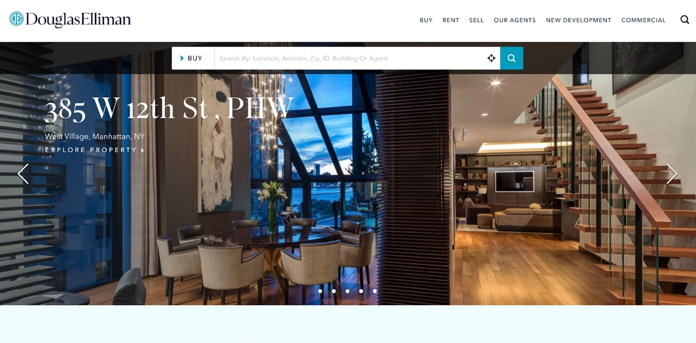
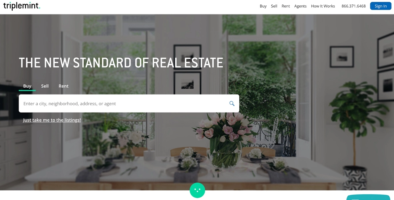
Additionally, the search bar should work quickly, show accurate results and ideally be placed on the homepage of your website. Many websites for real estate are using the advanced search feature like the ones here:
4. Sorting
To make looking for properties even more comfortable for visitors, including the sorting feature in your Real Estate Website. There are several ways to sort properties: latest, oldest, rent, buy, sell, featured, price, etc.
Sorting lets visitors choose properties with one click rather than looking through one listing to another.
Here is an example of an excellent sorting feature. Take a look.
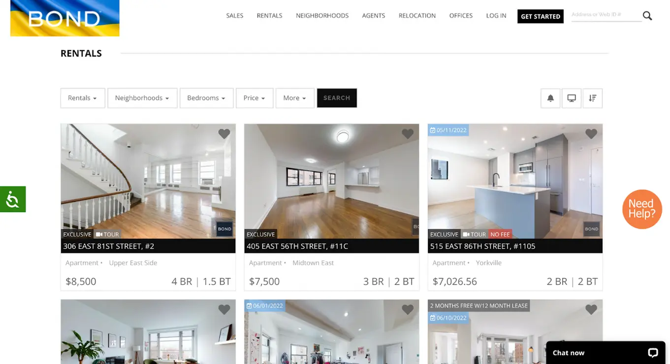
See how easy it’ll be for visitors to sort out properties with just a few clicks.
5. Customer-focused content
Your Real Estate Website should inform visitors what they want to know. Posting a random picture of a guy in a suit posing to talk on the phone isn’t going to close prospects anymore.
Prospects want to see the properties, their features, pricing, legal procedures to be followed and other information.
Irrelevant content will disrupt your closing rates and make prospects run away from your company. The impact of a poorly designed web page can be estimated with the example below.
Read Our Page : Real Estate Software Development Services
Here is a landing page for real estate buying and selling:
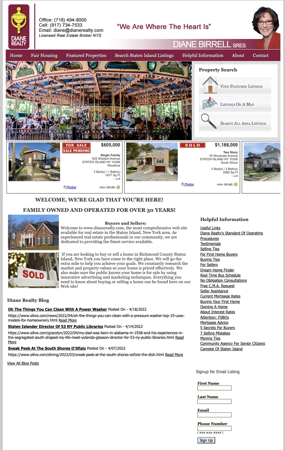
In one word – it’s too packed. At the first look, it confuses the user about where they should focus on the screen.
The banner heading – we are where the heart is – is vague. There is no direct message to selling or buying real estate properties.
And the merry go round picture as the top image does not invoke any emotions towards buying or selling houses. Or houses in general, and it is more apt for a theme park website or something related to kids.
The form at the bottom doesn’t have a compelling call to action. Simply putting signup will not move visitors to put their info and click the button. Instead, it should say “get a weekly listing in your inbox, ” which tells visitors what they’ll get after signing up for the newsletter.
Rather than the blog links, it is better to put testimonials of previous buyers or properties sold, which creates trust in the visitor’s mind and increases your authority.
To give you a clearer idea of what good content on a real estate company website looks like – look at the picture below.
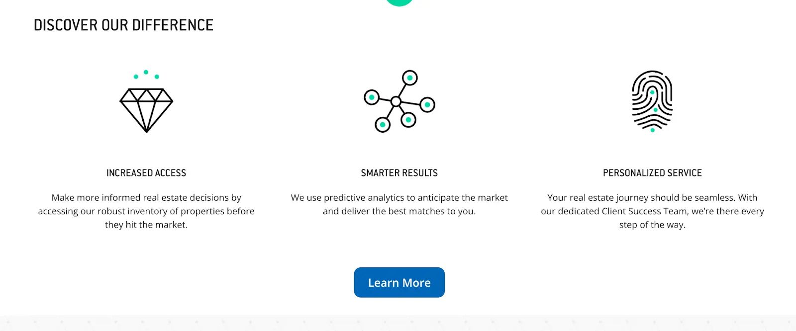
See how the key selling points are effortlessly presented on the screen. The content is simple, clear and concise, and the CTA button is highlighted with the proper color and invites the interested user to click on it. It would be best if you aimed for content like this.
To get professional help for writing short snappy copy, connect with our digital marketing team with creative content writers for the real estate niche.
6. Contact information
Provide your contact information and let home buyers know that your agents are available whenever they are ready to buy property. No business website is complete without contact details. If you miss this feature, be prepared to lose potential leads.
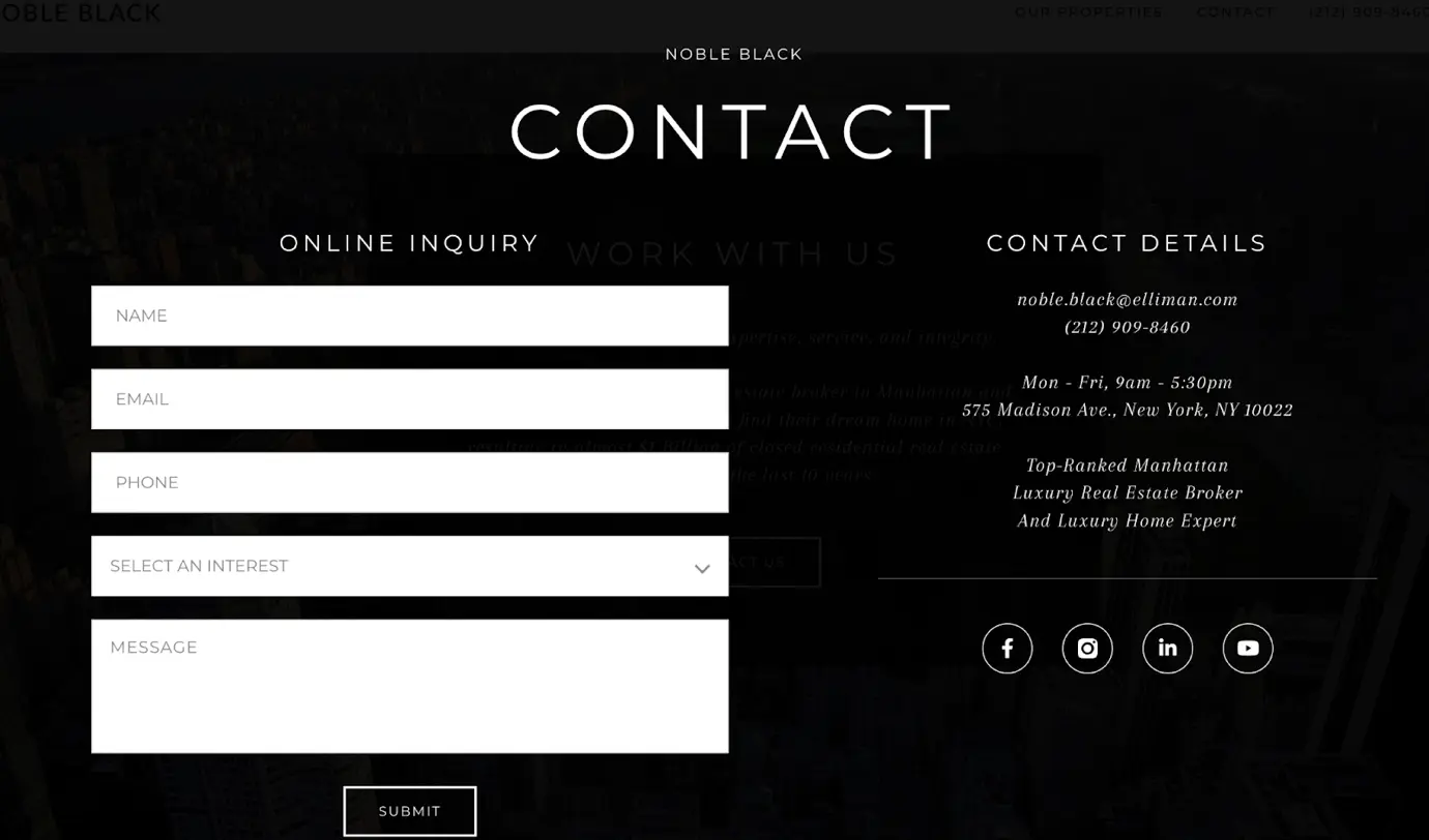
Here are the contact details on the Noble black website. They have done a great job by adding online and offline options to connect. The form has the relevant entries, and for offline visits, the office address and phone number are provided.
The page has the perfect closing with social media links to keep visitors connected in future.
7. Faster loading
It doesn’t matter if you have the best properties available, but if the users have to wait for another minute to view them, they’re probably gone.
Tech has been upgraded to an insane level of speed and accuracy. We are not living in the web 1.0 era; web 3.0 is here, raising users’ expectations of a more refined experience.
Flashing graphics, high-quality media, animations, and too many links are good, but they should not slow down your website.
Connect with our expert website developers if your real estate company website takes longer than a few seconds to load. They will revamp your website, remove the lags and make it load at blazing fast speed.
8. Consistent design & organization
A real estate company website has audiences with different goals at a time; sellers, buyers, renters, etc. So if your website has separate sections for them, make them look alike, and they should not look like they are from two different websites.
Along with the design, the organization of information is another crucial UX feature. Your site has the information buyers and sellers are looking for. Still, if it’s buried on an internal page, it will not make any difference because visitors don’t go too deep into any website to search for properties.
You mustn’t make prospects go through several pages for basic information. Ensure they can access the listing search tool and contact info with minimum screen switches.
Does your website need a design upgrade? Hire UI/UX designers and boast the most trendy real estate website with simplistic design and aesthetics.
9. Testimonials
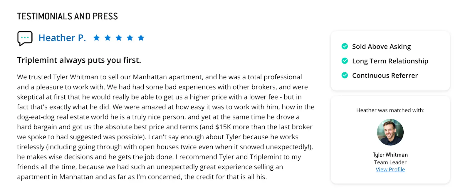
Testimonials are a great way to generate trust. Positive reviews about a business make customers want to be a part of other customers’ pleasant experiences.
Good feedback is proof of your excellent services. So ask your customers to share their experience on your website with their information and pictures. It would be best to ask for a video testimonial, and they seem more natural and authentic.
Real estate website development
Your real estate company website can flaunt more fancy features, but these are the fundamental ones.
While building a real estate website, our team always considers these basic features with the trendy ones. Our web development firm can assist you if your real estate company wants to update, redesign, or modernize its website for good business.
Hire our expert web developers and UI/UX designers to get a premium website which sells dream homes to your customers.
We’re honored to mention that our efforts have been recognized by renowned B2B review and research platforms such as GoodFirms, Clutch, MirrorView, and many more.
Similar Posts

Top 10 Programming Languages for 2025
The software development realm is always active. With new advancements, there arises a need for new programming languages that can serve modern functions. Did you know more than 700 programming languages are in practice today? Though, only a few hold the power, and shape the innovation over the tech world. And with the constantly fast-paced […]...

Top 10 Javascript Frameworks
There are several popular Javascript frameworks out there and there is continuous effort to add more values to the code repository. But with such expanding range of choices, often it is a little confusing to decide on a framework that you actually need. Well, this is when a detailed comparison of the most popular and […]...

Managing Investor Expectations: Strategies for Founders and CEOs
In the world of entrepreneurship, gaining an investor is often considered the achievement of the ultimate goal. But in reality, it is a mere point of departure of a lengthy and complex competition. A founder or CEO isn’t only the creator of the company; it is also an intermediary between the investor expectations and choice […]...


