Optimizing healthcare
costs and outcomes.
- Industry: Healthcare
- Country: USA
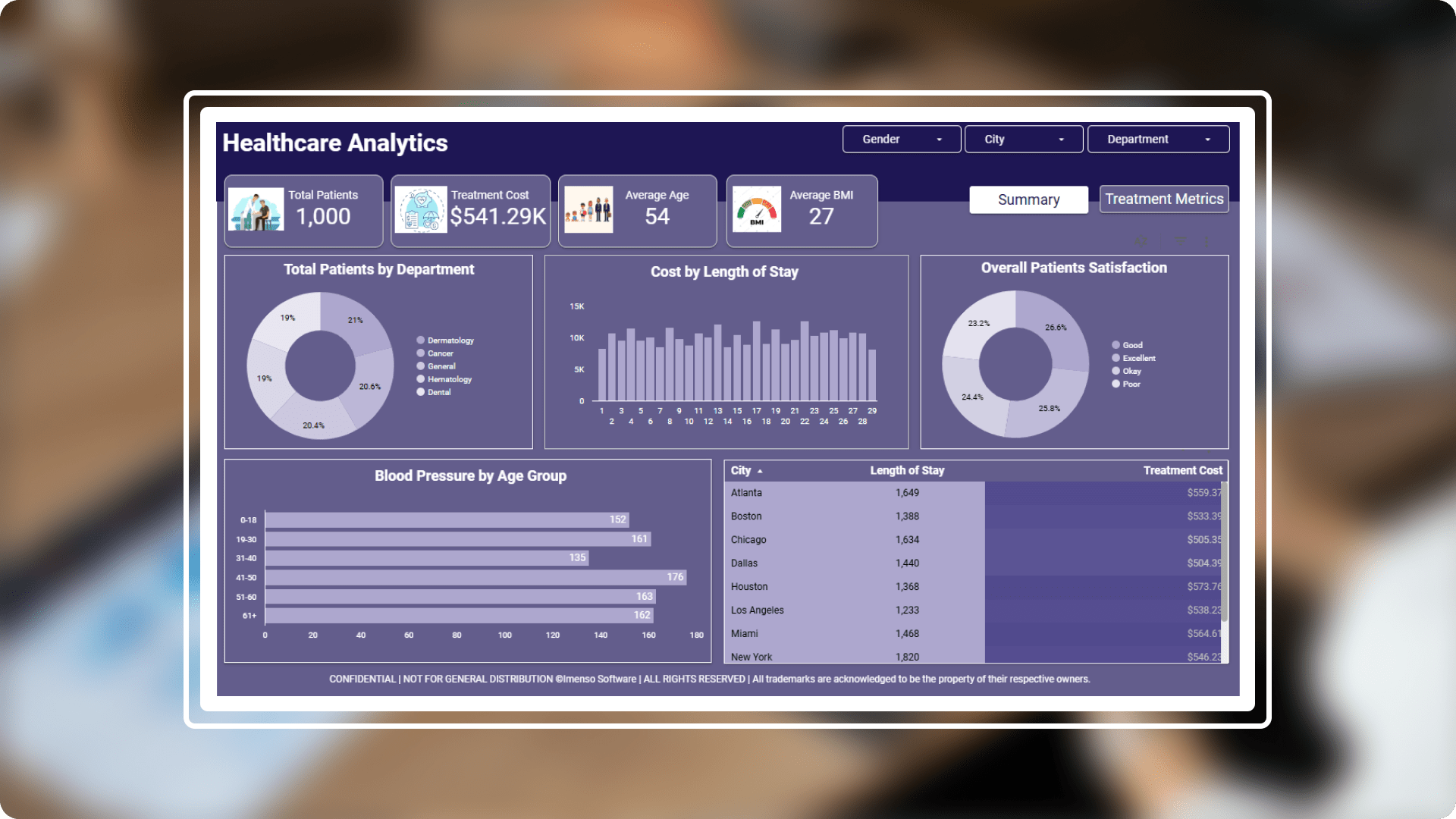
The main aim of healthcare analytics appears to be providing insights on various healthcare metrics and probably aimed at stakeholders looking to optimize healthcare costs, improve patient outcomes and understand trends in healthcare services.
The core challenges
- Data accuracy and quality: Healthcare data can sometimes be incomplete, inaccurate, or inconsistent. missing values, incorrect formats (like dates), or duplicate records can affect the reliability of your insights.performed thorough data cleaning, validation, and transformation before visualizing data.
- Standardization of medical terms and codes: Healthcare data often uses specific medical codes (ICD-10, CPT codes, etc.) and terminologies, which may differ between systems or countries.
- Integration of different data sources: Used proper data modeling techniques (e.g. star or snowflake schemas) and tools like looker studio's connectors to integrate various data sources. ensure that the data sources share common keys or fields for accurate joins.
Solution A Healthcare dashboard is a visual reporting tool designed to display key healthcare data and metrics in a way that is easy to understand and actionable. It helps healthcare professionals, administrators, and decision-makers to monitor performance, track patient health trends , and make data-driven decisions.
-
 Enhanced visualization: Incorporated forecasting features for healthcare costs, patient inflow, or other metrics to allow hospitals to better predict resource allocation.added time-based trend charts for a historical view of costs, patient counts, etc. to help decision-makers understand how metrics are evolving over time.
 -
 Data security and compliance: Ensured that data masking is applied to personally identifiable information (PII) and patient health data to maintain privacy.encrypted data at rest and in transit to ensure the security of sensitive healthcare information.
 -
 User experience: Ensured filters are more robust, allowing users to explore data not only by gender, city, or department but also by age groups, treatment types, or diagnosis.created separate pages or sections for different stakeholders. for instance, one page can focus on operational KPIs for administrators, while another can focus on financial metrics for executives.
 -
 Embedded reports: Embedded reports in an analysis dashboard enhance user experience by providing detailed, interactive, and customizable insights without requiring users to leave the dashboard.
Integration.
Equipped with a variety of
data sources.
Organizations may increase decision-making, data accessibility, workflow efficiency, and process streamlining by integrating. We used the following integration capabilities to generate this report:
- Google Sheets
Customization.
How we played with charts?
In order to effectively display the data, we did more than just add charts; instead, we gave each one a unique design that served its intended function.
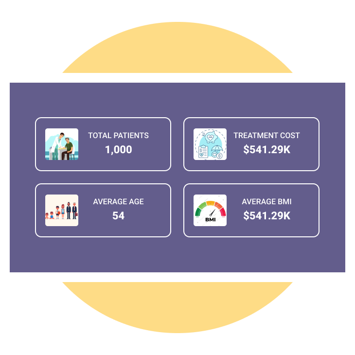
KPIs
Created KPIs where we included Total Patients, Treatment Cost, Average BMI, Average Age.
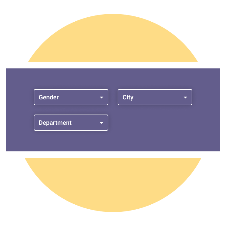
Slicers
Created slicers for interactive and user-friendly sales dashboard that enhance data exploration and decision-making.
Page navigation
Created the buttons to switch from source to destination page through page navigation.
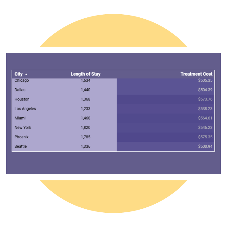
Conditional formatting
Applied Conditional formatting to the table chart to represent the total patients using bars.
Enhancement.
By adding useful features.
Adding different kinds of charts, like bar, pie chart and cards, makes the dashboard look better and the user experience more interesting and immersive.
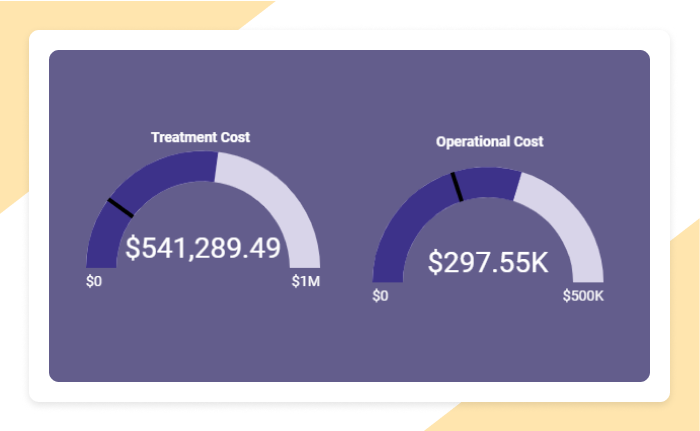
Gauge chart
The Gauge chart represents the treatment cost, operational cost, average length of stay representing the target lines.
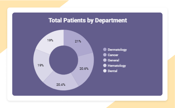
Donut chart
The Donut chart represents the total number of patients by department.
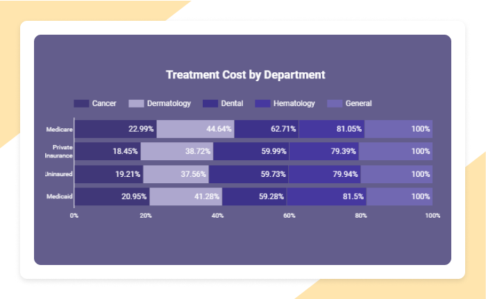
Stacked bar chart
This chart represents the treatment cost for each department along with payer.
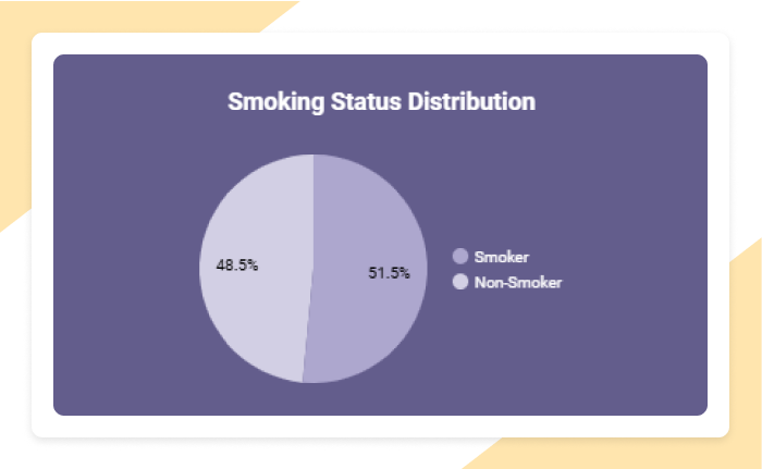
Pie chart
The Pie chart represents the percentage distribution smoking.
Explore more.
Additional features.

User defined KPI’s. Allow users to define and track their own custom KPIs in addition to the default ones shown. They could, for instance, create a custom KPI that combines operational costs with patient volume.
Interactive filters. Add more interactive filters like Gender, City or Department to allow dynamic filtering by different dimensions (e.g, gender, city etc).
Export preferred charts/KPI . With the export feature, users can easily clean up their data and save it. There are several methods to export a BI report. Here's a list of common export methods: PDF, PowerPoint, Excel, CSV, Web, Service API
