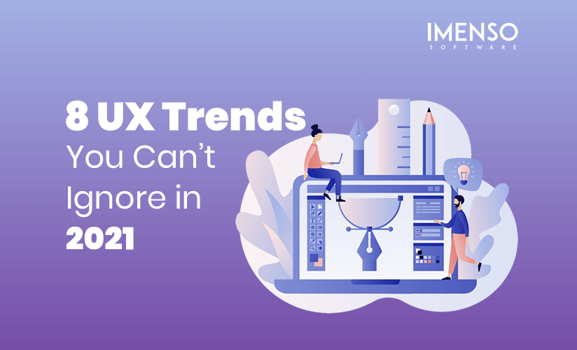
8 UX Trends You Can’t Ignore in 2021
2020 has been an unusual year for all of us. After the coronavirus pandemic, the physical human interactions have changed, but the digital interfaces have altered.
Human experience with digital devices has shifted, and thus we are now ready to try more innovative UX methodologies to further take the digital experience into the future.
Today we’ll see the most dominating trends of user experience and design that will dominate 2021 and even further.
Let’s get started.
1. Voice Search Interfaces
The world is shifting from text to voice. This is no more just a fad but a monstrous trend taking over the digital product and app market. The voice interfaces are becoming the hottest trend not only for 2021 but way longer than that. Let’s just say that if you are looking to add a new feature to your app, then the voice search interface should be your top priority. Digitally users expect a more simplistic and efficient experience and voice search, chatbots, and virtual assistance are the way to get there.
More and more brands are integrating voice interfaces in their app and websites. The global fast-food giant KFC has recently added a voice command based chatbot to help customers place orders, explain food items and offers.
2. Minimalistic UI Design
Information overload on screens is a significant pain for website visitors these days. As website owners have more and more information – newsletter signups, cookie policy, ads, and other notifications to convey and not enough space, minimalistic design is the bridge to meet visitors’ and creators’ demands. It is the most mainstream design change in recent times.
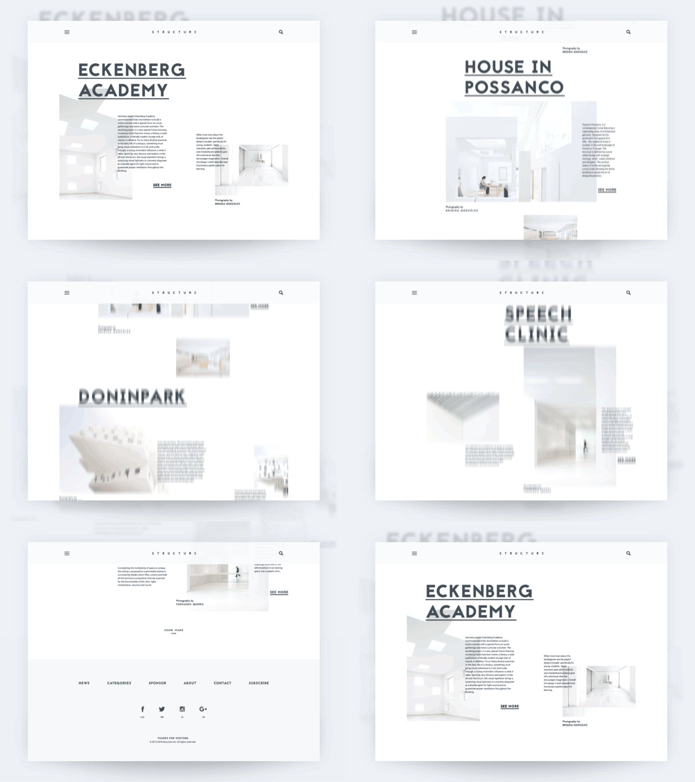
Although we mention fewer components on a screen, the minimalistic design doesn’t mean a boring or straightforward layout. It is the creative use of vibrant colors, design elements, proportions, and compositions by UX designers to make it elegant and efficient.
It is the beginning of creatively exploring how to convey the right message without unnecessary decorative components. Which eventually lead website owners to write short, concise, and compelling content for web pages.
3. White Space
White space or negative space is the new UX design trend to create visually relaxing UI. These are rapidly becoming a new element in empty regions around objects in macro or micro slot. Negative space is critical to optimize the user experience and simply meet the market demand for minimalistic UI.
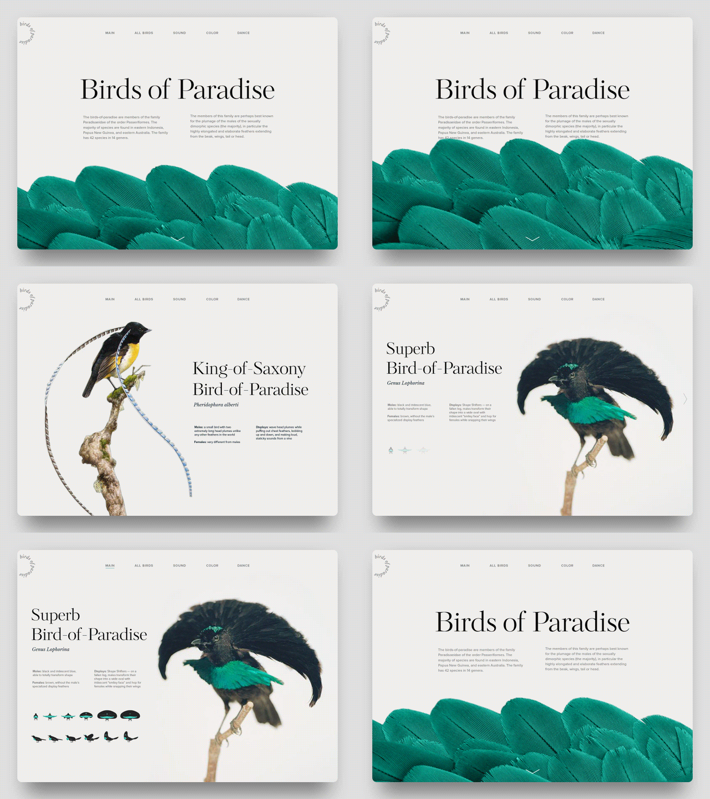
The main goal of UX designers to leave space or silence in design is to draw users’ attention to what’s necessary. Although the careful placement of white spaces is vital to the page’s aesthetics, it might look like information is missing. Start with establishing the right content hierarchy to get users to your desired action.
4. 3D Effects and Parallax
3D elements and parallax are not entirely new trends. They have been around for a while, but recently these designs are catching popularity in web flow. You can observe these fancy effects in eCommerce and fashion websites to create a pop-up effect for products.
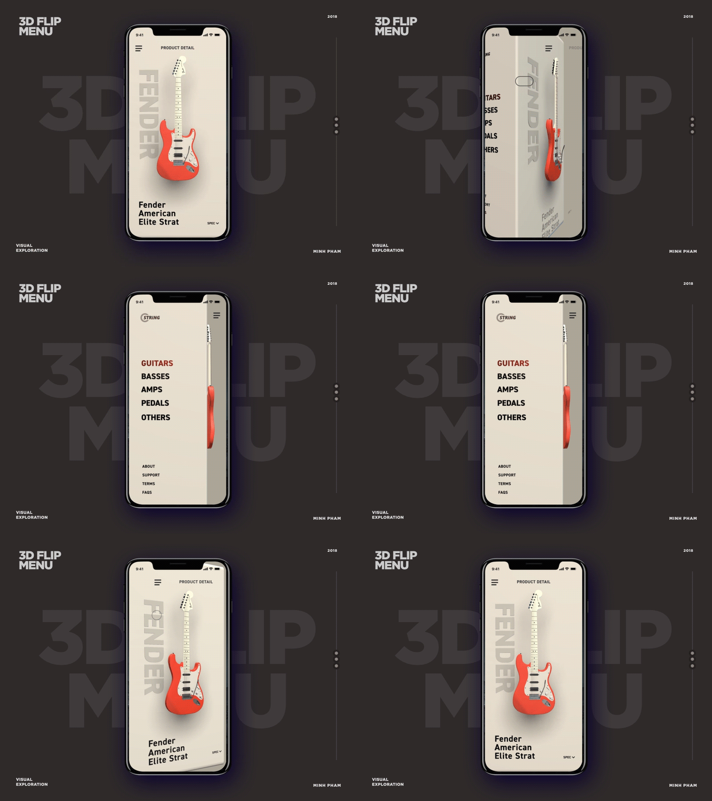
To create a unique user experience, it is a cool trend to combine 3D elements with a parallax effect in one interface. Parallax scrolling alone creates a depth effect with moving images in the background. When mixed with 3D objects, it creates an eye-catching effect that stays in the user’s mind for a long.
5. Animation and Videos
It should be no surprise that videos are the future of marketing on every digital media platform conceivable. And so are animations in UX design. Today on websites of all genres and industries, you can find either animation, GIFs, doodle videos, or other motion design forms. Their success is they are the most engaging form of design element and have a longer-lasting impact on visitor’s memory. Animations bring life to otherwise simple and still design components.
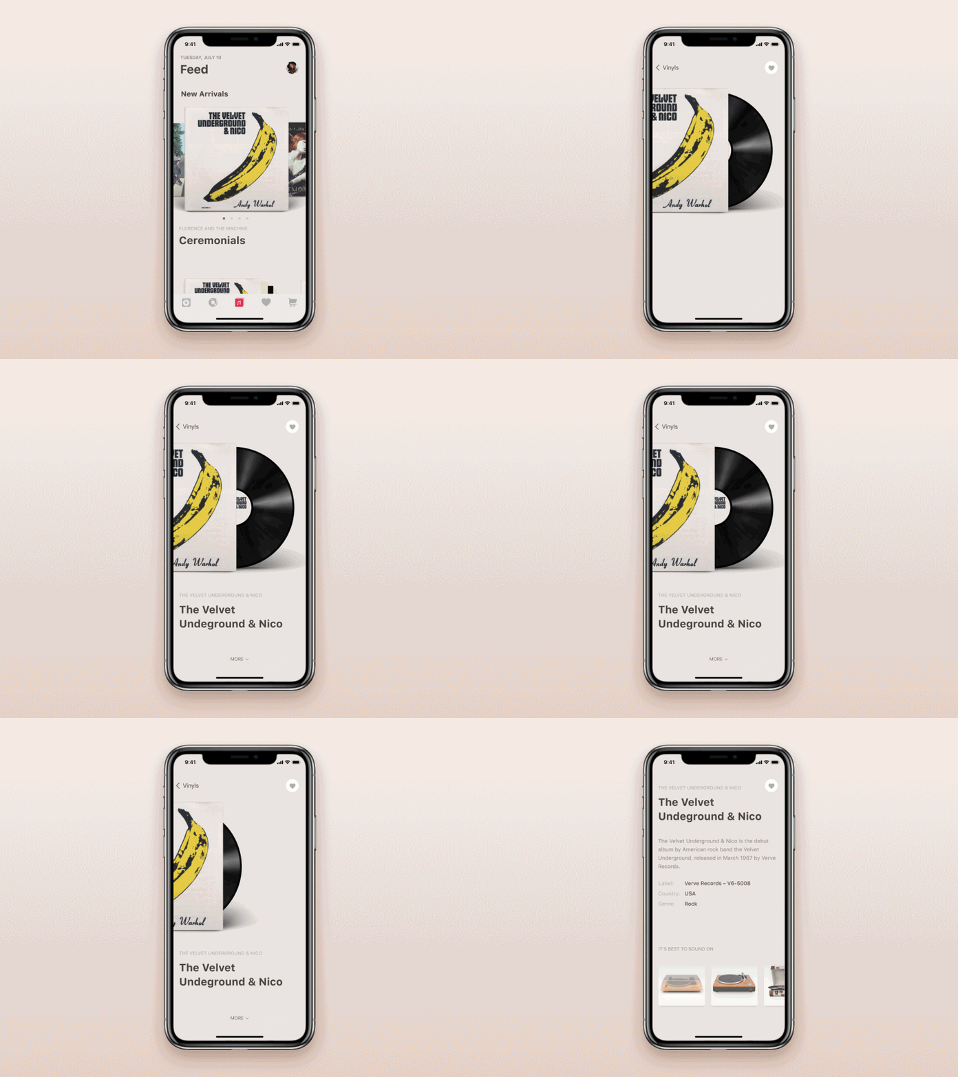
But you must use this design trend wisely in your interface. Objects floating on the screen unnecessarily might make visitors leave sooner than they want to. Before using animations in software development, make sure they are valuable and consistent with the rest of the design and go smoothly.
6. Asymmetric Design
In art and design, asymmetry is not considered rough. Although as the screen is becoming wider, there are large spaces to occupy. If used creatively, asymmetry is an excellent design method to render your brand, product, or service a singular experience.
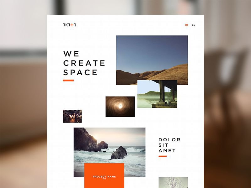
Asymmetry is often merged with web design patterns such as overlapping elements, split screens, and more. Be careful to not place pieces randomly to make an asymmetrical design; it should make it easy to locate important information for users.
7. Neumorphism
Neumorphism is a blend of the two most used approaches in UX design Skeuomorphism and flat design. UX designers did the best to create a life-like interface but with minimalistic design and bright colors. And unlike Skeuomorphism, it doesn’t create hyper-real elements. Instead, designers use shadow and gradient features to make buttons and other objects with light colors and contrast.
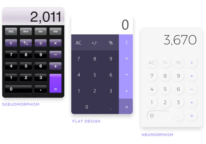
There are not many digital products with Neumorphism designs, but they have been the most loved ones among UI/UX professionals. There will undoubtedly be more placement of Neumorphism examples in apps and websites.
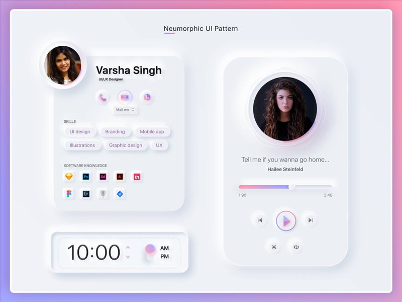
Image credit: Varsha Singh
8. Imperfect designs
After the coronavirus pandemic, imperfect elements are the newest trend as the world has changed, so has UX. Designers create defective elements to take a unique stand for their brand. It can be anything from unusually sized images or characters of various sizes and proportions.
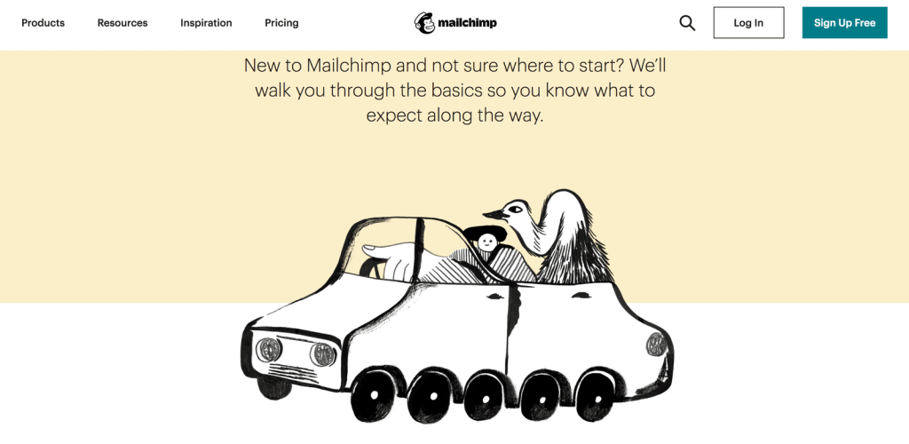
While the application of imperfect designs UX trend, be cautious to not overdo it.
Conclusion
One definite thing we learned from 2020 is we can’t predict everything of the future. This article is a guide to help your businesses build digital products that have the edge over your competitors.

For more futuristic design ideas, hire UI/UX designers from Imenso Software. From 3D elements to escapism, we are driven to make UI/UX experiences yet to come.
Similar Posts
What Are NFTs And How Do They Revolutionize Digital Art?
On 11th March a painting by Beeple – an American digital artist sold for $69 million at Christie’s. Since then NFTs is the new mystery term that everyone is interested in. a lot of you are confused as to how NFTs are created, how they work and how can someone earn from them? And where can you […]...
Imenso Software Succeeds by Offering Client-Focused Services: GoodFirms
Having the required expertise and experience to develop and deploy customer-oriented solutions endows Imenso Software as one of India’s top web development companies at GoodFirms....

Deeply Bound to Produce Qualitative IT Products, Imenso Software Justifies Why their Customers Trust their Products: GoodFirms
When client-centric development solutions are needed, Imenso Software always stays on top to serve its customers. Jimmy Kamboj, the founder and CEO of Imenso Software, shares its transformation story with us from a small enterprise to a top IT service provider. Specialized in delivering hi-tech solutions through its unique consultative approach, Imenso Software was established […]...
